From Fedora Project Wiki
< Fedora Community | Mockups
m (moved FedoraCommunity/Mockups/NavigationRethinking to Fedora Community/Mockups/NavigationRethinking: wiki standards) |
|||
(No difference)
| |||
Latest revision as of 14:09, 20 July 2009
Proposal
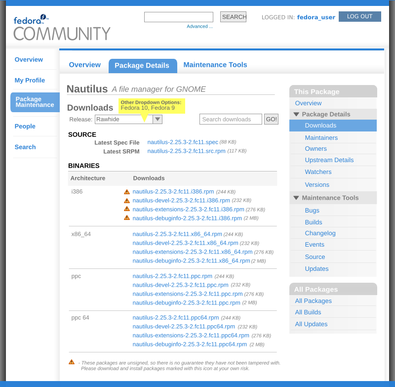
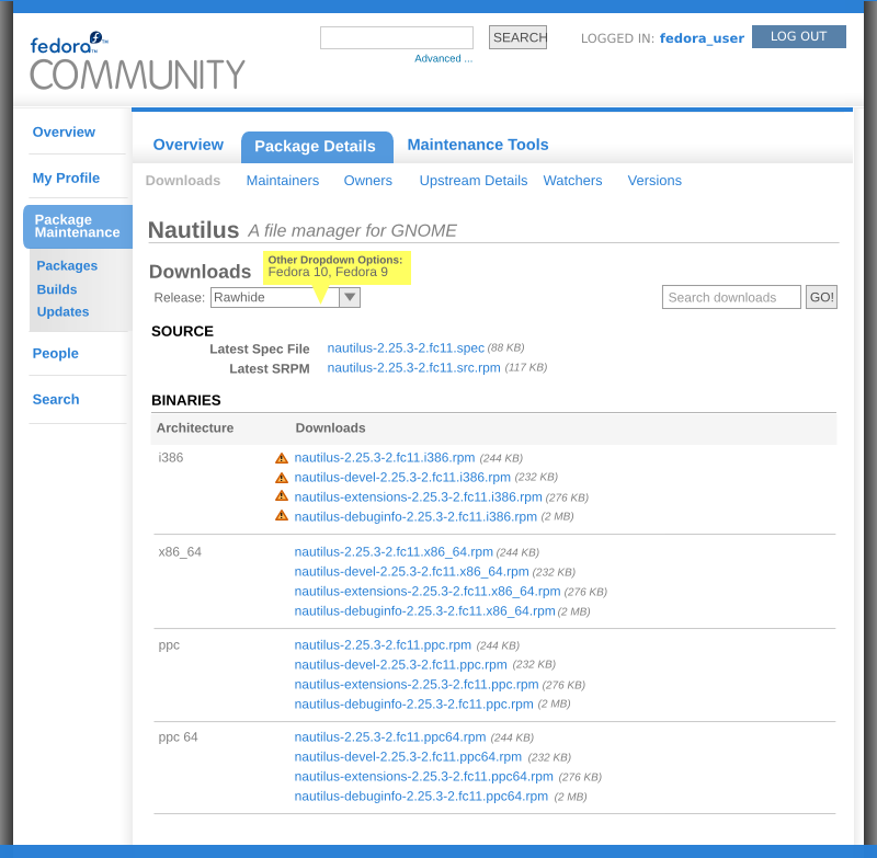
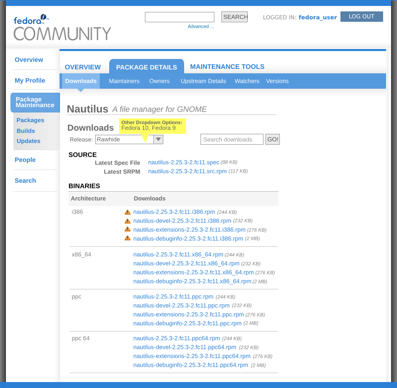
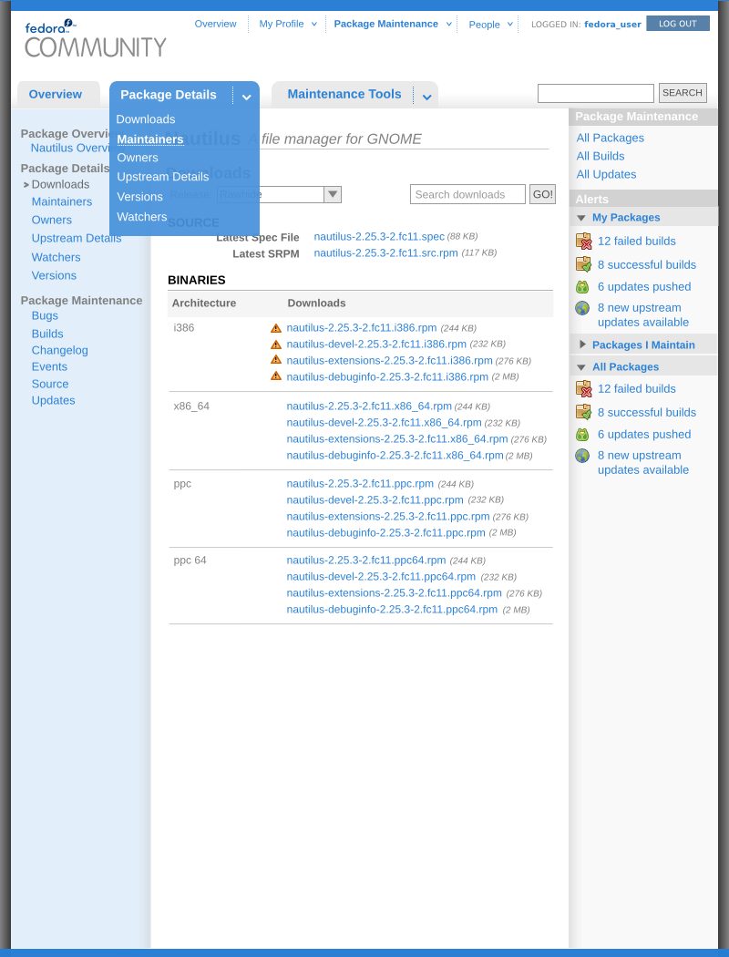
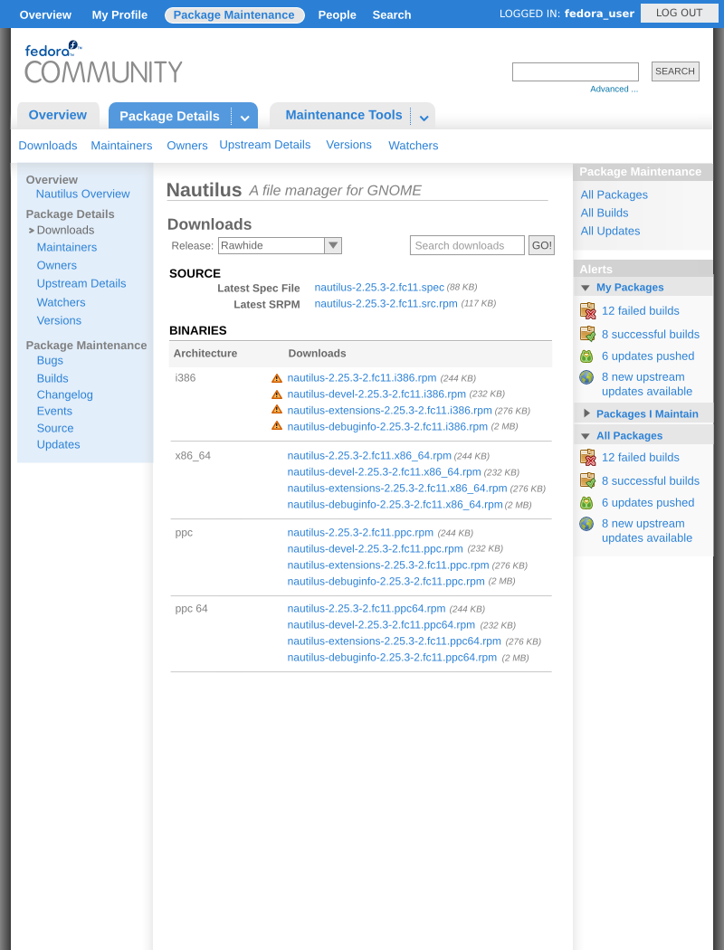
Here is the solution I propose we go with for readjusting the navigation. Here are the changes we'll need to make:
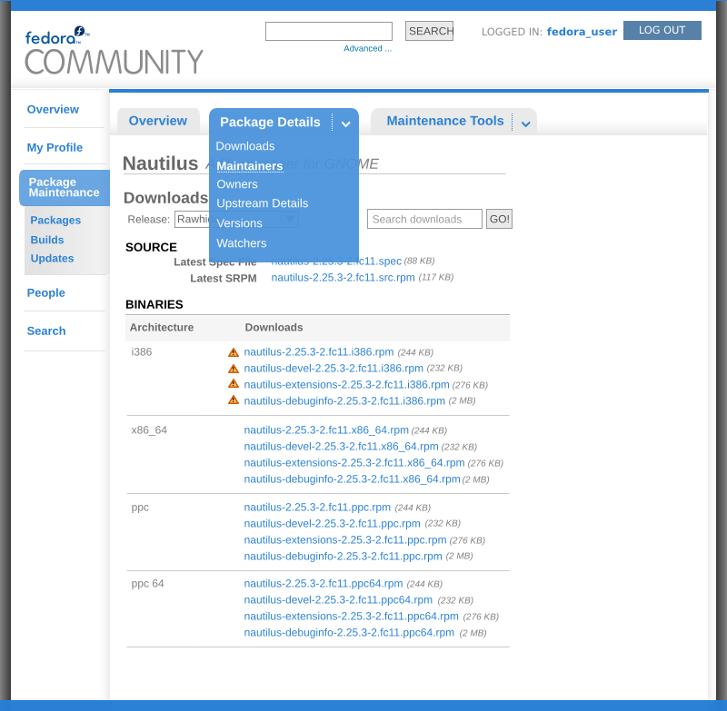
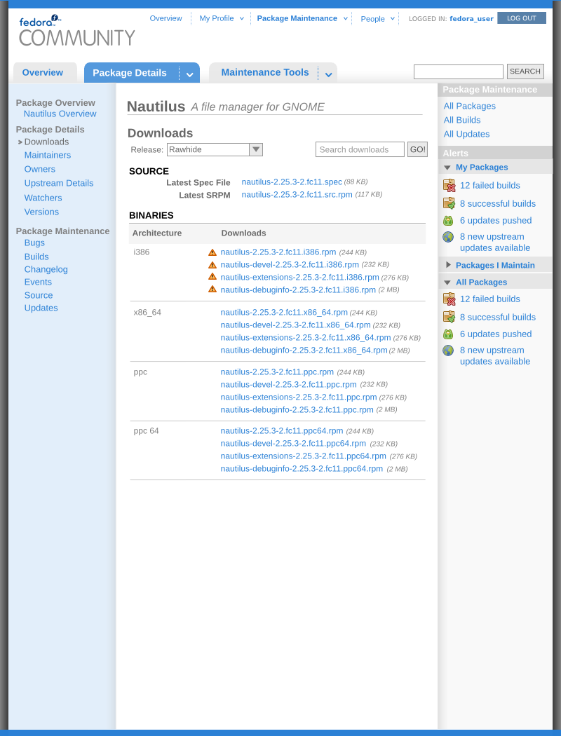
- the tabs on the top of the package details pages should be:
- Overview
- Package Details
- Maintenance Tools
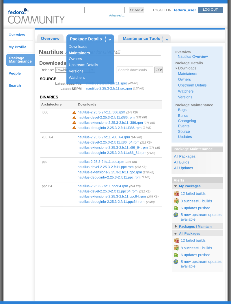
- s/Package Maintenance/Maintenance Tools - for the right nav bar - I think this wording is more effective at communicating the differences in the link categories.
- Add the 'All Packages' navigation with links to all packages, builds, and updates so they are available with only one click. Add this panel to every package details screen.
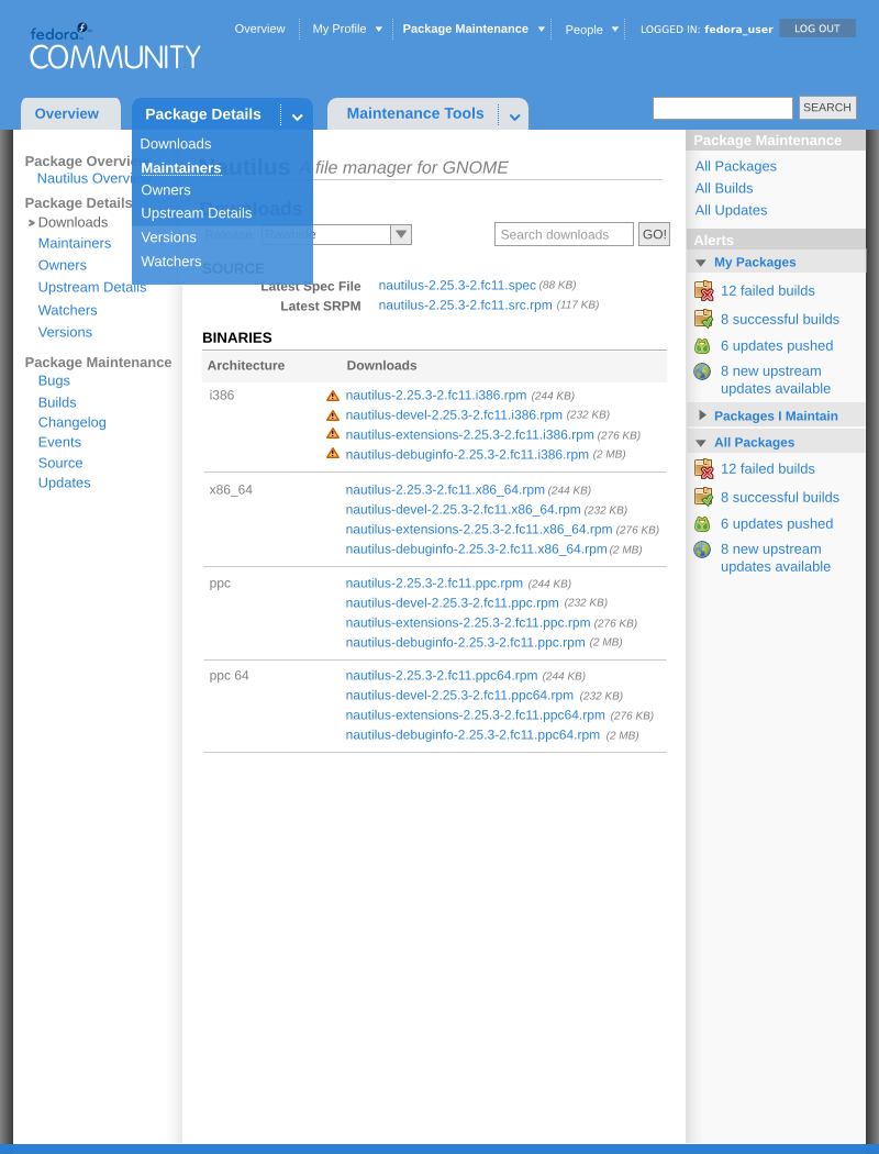
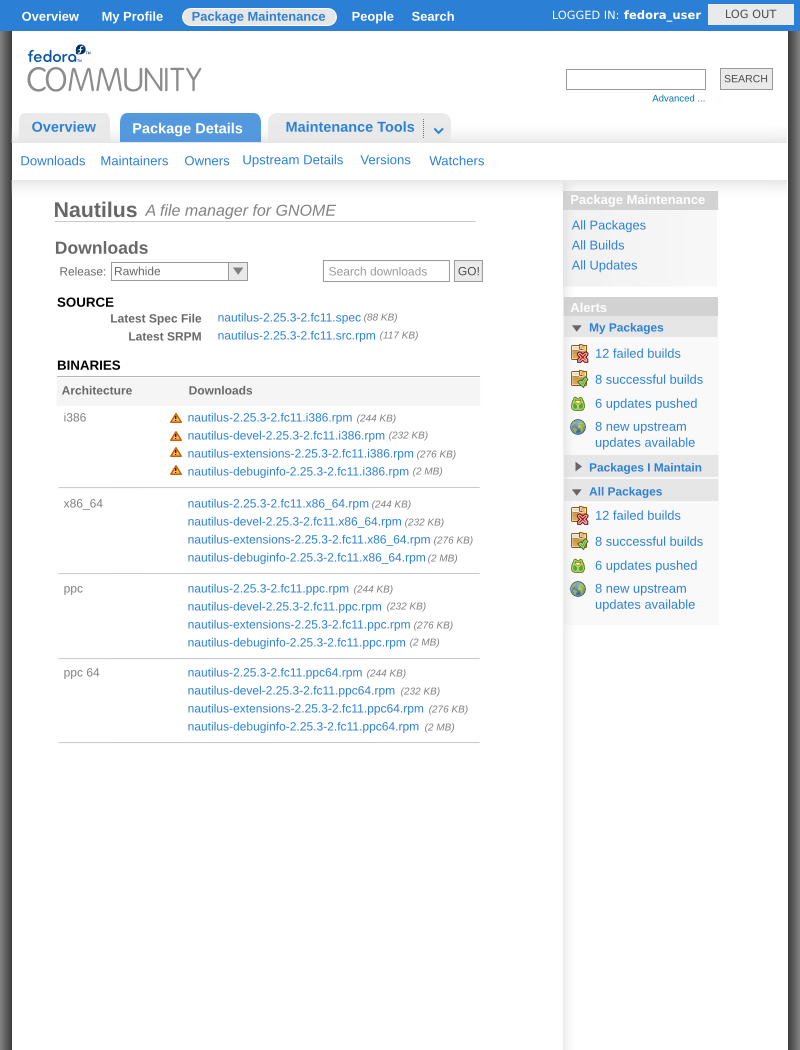
Here's the mockup for this:
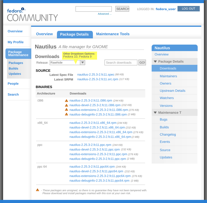
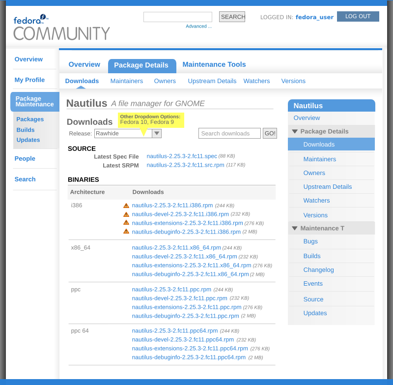
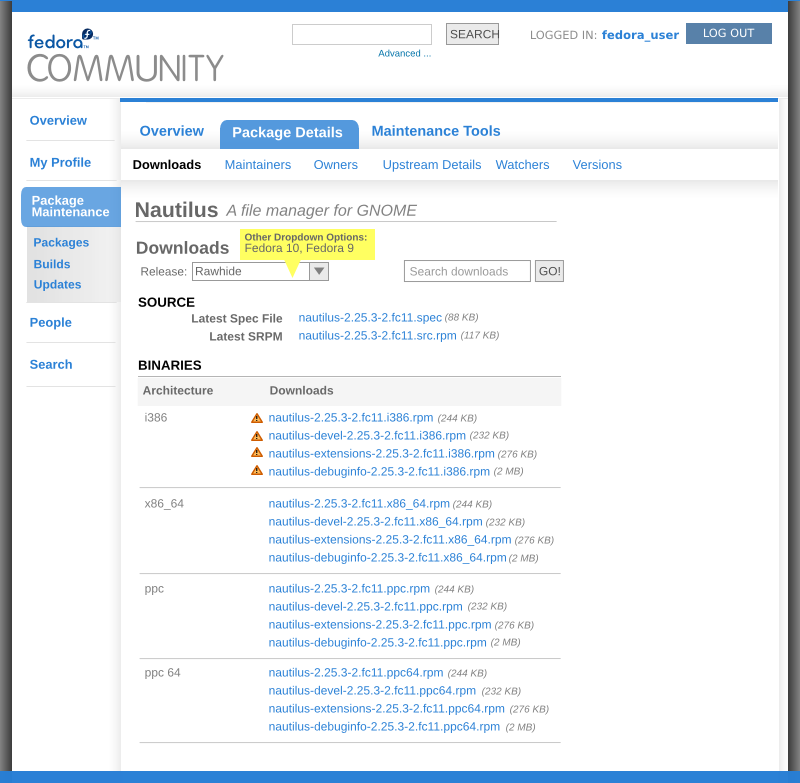
Other Mockups
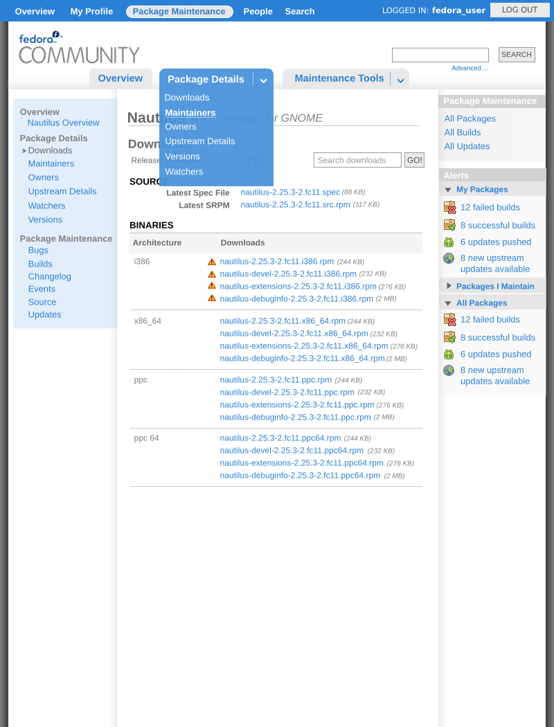
Here are some other ideas at reconfiguring the main navigation for Fedora Community. I'm not really happy with a lot of them but used them as a tool to brainstorm different possibilities.

