No edit summary |
m (Replace yum call with dnf call) |
||
| (10 intermediate revisions by 4 users not shown) | |||
| Line 1: | Line 1: | ||
= | = Fedora Presentation Template = | ||
[[Image:Fedora-slide-template title-slide base.png]] | |||
You may download the Fedora Presentation template below: | |||
'''[[Media:fedora-designninja-presentation-submission.otp | Download the Fedora Presentation Template OpenOffice.org OTP File]]''' | |||
[[Media:Fedora_Slide_Deck_16x10.otp | Widescreen version (16:10)]] | |||
This was designed by Emily Dirsh of the [[Design | Fedora Design Team]]. | |||
There is also an unbranded version of the template available under the [http://creativecommons.org/licenses/by/3.0/ Creative Commons Attribution 3.0] license. The following points are also applicable to the unbranded version. | |||
'''[[Media:Unbranded-designninja-presentation-template.otp | Download the Unbranded Presentation Template OpenOffice.org OTP File]]''' | |||
Some points to note up-front: | Some points to note up-front: | ||
* '''You will need to install two fonts for the templates to work correctly.''' [https://fedoraproject.org/w/uploads/4/4a/Font-sample-comfortaa.png Comfortaa] is used for titles and [https://fedoraproject.org/w/uploads/9/96/Font-sample-droidsans.png Droid Sans] is used for body text. You can istall it with: | |||
# dnf install aajohan-comfortaa-fonts google-droid-sans-fonts | |||
* The template uses a light text on a dark background. This is because slide presentations are usually shown on a projector, and having a light-colored background can be overwhelming since it physically sends a lot more light to the viewer than a darker background. Sticking with light text on a dark background rather than vice-versa should make for a more pleasant viewing experience. | * The template uses a light text on a dark background. This is because slide presentations are usually shown on a projector, and having a light-colored background can be overwhelming since it physically sends a lot more light to the viewer than a darker background. Sticking with light text on a dark background rather than vice-versa should make for a more pleasant viewing experience. | ||
* What counts as a 'title', and what counts as 'body text' is sometimes confusing. The presentation title and slide titles are definitely titles, and bullet points are definitely body text. Beyond that is up to you. | * What counts as a 'title', and what counts as 'body text' is sometimes confusing. The presentation title and slide titles are definitely titles, and bullet points are definitely body text. Beyond that is up to you. | ||
* | * This template is meant to span multiple releases, so we've avoided tying the template to a specific Fedora release. | ||
Some points slide-by-slide: | Some points slide-by-slide: | ||
| Line 65: | Line 73: | ||
= Inspiration = | = Inspiration = | ||
When adding your own slides as you customize this template for your presentation, please feel free to be as creative as you'd like! Don't feel restricted by the slide template - it is provided to you as an aid, not to restrictyour creativity. You can customize your slide deck with illustrations, innovative layouts - let your creativity go wild, and feel free to ask [[Design | the Fedora Design team]] for assistance with any graphics you need developed for your presentation. | |||
Here's some inspiration found from popular slide shows on [http://slideshare.net http://slideshare.net ]: | Here's some slide inspiration found from popular slide shows on [http://slideshare.net http://slideshare.net ]: | ||
<gallery> | <gallery> | ||
| Line 78: | Line 86: | ||
Image:canaanbook-inspiration-slidedeck.png | http://www.slideshare.net/canaanpartners/canaan-entrepreneur-pitchbook-presentation | Image:canaanbook-inspiration-slidedeck.png | http://www.slideshare.net/canaanpartners/canaan-entrepreneur-pitchbook-presentation | ||
</gallery> | </gallery> | ||
Latest revision as of 01:06, 26 March 2018
Fedora Presentation Template
You may download the Fedora Presentation template below:
Download the Fedora Presentation Template OpenOffice.org OTP File
This was designed by Emily Dirsh of the Fedora Design Team.
There is also an unbranded version of the template available under the Creative Commons Attribution 3.0 license. The following points are also applicable to the unbranded version.
Download the Unbranded Presentation Template OpenOffice.org OTP File
Some points to note up-front:
- You will need to install two fonts for the templates to work correctly. Comfortaa is used for titles and Droid Sans is used for body text. You can istall it with:
# dnf install aajohan-comfortaa-fonts google-droid-sans-fonts
- The template uses a light text on a dark background. This is because slide presentations are usually shown on a projector, and having a light-colored background can be overwhelming since it physically sends a lot more light to the viewer than a darker background. Sticking with light text on a dark background rather than vice-versa should make for a more pleasant viewing experience.
- What counts as a 'title', and what counts as 'body text' is sometimes confusing. The presentation title and slide titles are definitely titles, and bullet points are definitely body text. Beyond that is up to you.
- This template is meant to span multiple releases, so we've avoided tying the template to a specific Fedora release.
Some points slide-by-slide:
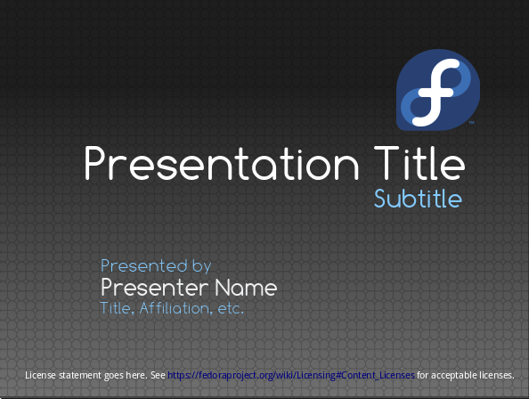
Title Slide
- This slide is left up on-screen before the speaker starts, so it may be visible for a while.
- There's room for both a presentation title and subtitle
- The presenter's name is given a space, and beneath there are fields for their job title / affiliation / background
- In the lower left there is a spot for the presenter to indicate the license of their slides
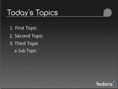
Topic Overview
- Today's topics is a bulleted list of all the topics covered in the presentation - like a table of contents
Topic Splash
- Before each topic in the presentation is covered, there's a slide to indicate the title of the topic that is about to start, centered and in a large size font.
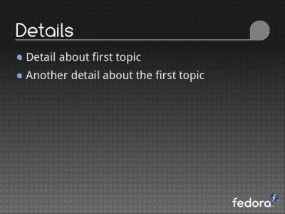
Topic Details
- This slide represents the meat of a topic in the presentation.
- These slides might have pictures, bullet points, flat text descriptions, diagrams - pretty much anything.
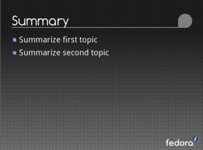
Summary
- This slide serves as a quick run-down of all topics covered to summarize the speaker's points.
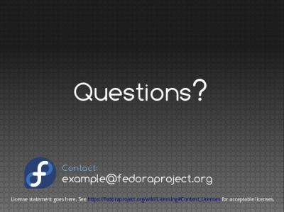
Questions Slide
- This slide is left up on-screen while the speaker handles questions, so it will be up for a while.
- The speaker's contact information is displayed in the lower left.
- The slide license details are displayed again in the lower left.
Inspiration
When adding your own slides as you customize this template for your presentation, please feel free to be as creative as you'd like! Don't feel restricted by the slide template - it is provided to you as an aid, not to restrictyour creativity. You can customize your slide deck with illustrations, innovative layouts - let your creativity go wild, and feel free to ask the Fedora Design team for assistance with any graphics you need developed for your presentation.
Here's some slide inspiration found from popular slide shows on http://slideshare.net :

