No edit summary |
m (internal link cleaning) |
||
| (27 intermediate revisions by 4 users not shown) | |||
| Line 1: | Line 1: | ||
Leave your feed back for the [ | Leave your feed back for the [[File:F14-image2.png|Fedora 14 wallpaper theme concept]], shown below. | ||
[[Image:F14-image2.png]] | [[Image:F14-image2.png | 450px]] | ||
'''Some earlier iterations:''' | '''Some earlier iterations:''' | ||
[[Image:Background_concept.png]] | [[Image:Background_concept.png | 200px]] | ||
[[Image:F14-image1.png]] | [[Image:F14-image1.png | 200px]] | ||
[[Image:Wallpaper-f14-concept-kyle-blender.png | 200px]] | |||
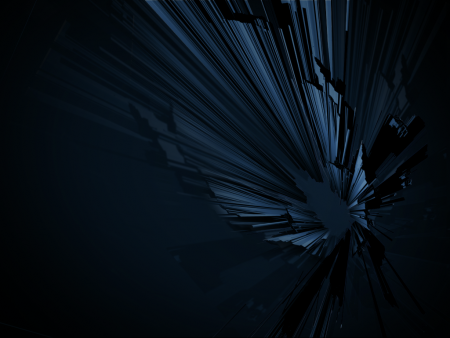
There's a couple of reasons why this theme relates to Fedora 14. First, [[Name_suggestions_for_Fedora_14|the codename for Fedora 14 is 'Laughlin']]. This is after Robert Laughlin, the 1998 Nobel Prize winner in physics for the fractional quantum Hall effect research he did. Laughlin argues for a concept called 'emergence' which states: "The whole is more than the sum of its parts." Kyle's proposal shows many separate lines coming together that, when you step back, forms a solid shape as well, relating to Laughlin's concept of emergence. Secondly, Fedora is a kind of a single object - a Linux-based operating system - but it's also a community made up of many individuals from all over the world and aggregating many individual open source projects and work. So the concept also relates to what Fedora itself is. | |||
= Open Feedback Area = | = Open Feedback Area = | ||
Post your | === Open Feedback === | ||
{{Admon/note | Place your feedback here!}} | |||
* ''Post your freeform feedback here! Be sure to sign it.'' | |||
* I'm a bit concerned that this looks too reminiscent of a broken LCD screen. Am I crazy? --[[User:Mattdm|Mattdm]] 12:49, 14 July 2010 (UTC) | |||
* [[User:Nmarques|Nelson]] said on July 14 @ 17:19 GMT: "Kyle's work is awesome and in a way provides a good alternative for alpha channels approach. From my point of view this allows a bit more of customization and interaction from the user. Thanks for a great submission, extended also to all other submissions." | |||
* The lines at the top look more like a plane and at the bottom they look more like separate lines (a bit too cluttered at the bottom). Also, its tough to figure out what the lines are converging to at the centre of the image - is it just space? Overall, the image looks cool because of the steel blue effect, but it is tough for a first timer to see beauty in this image . --[[User:Sahilahuja|Sahilahuja]] 18:14, 23 July 2010 (UTC) | |||
= Gathered Feedback = | = Gathered Feedback = | ||
We'll gather feedback from a variety of places here. | {{Admon/caution | Do not place your feedback here. Please add it above in the [[F14_Artwork_Feedback#Open_Feedback|Open Feedback area]]. Thanks! }} | ||
We'll gather feedback from a variety of places here. | |||
=== From Design Team Meetings === | |||
* needs more fedora blue | |||
* needs more blue instead of black | |||
* needs more shiny things | |||
* too dark | |||
* favorite is the latest mokcup | |||
* one user's first comment was that it's kind of dizzy-looking, any way to tone it down? | |||
== Blog Post Feedback == | Posted by --[[User:Duffy|Duffy]] 03:09, 14 July 2010 (UTC) | ||
=== Blog Post Feedback === | |||
(owner: mizmo) | (owner: mizmo) | ||
* | * http://mairin.wordpress.com/2010/07/13/fedora-14-theme-preview/ | ||
==== Feedback ==== | |||
* Felix said, on July 14, 2010 at 2:08 am: "Looks already great. I hope you can get some input from Jakub for the polishment." | |||
* Christof said, on July 14, 2010 at 2:18 am: "That finally looks like a background I would use. I think I have not used the default Fedora background or theme in the last five years." | |||
* jreznik said, on July 14, 2010 at 2:34 am: "Nice Kitty! Sorry, I missed meeting yesterday – but I’m happy with this concept ;-)" | |||
* Dave Pawson said, on July 14, 2010 at 3:20 am: "Re Kyles design? Yes, looks good. How to make it a little brighter? Bit too sombre at the moment?" | |||
* Jared Morgan said, on July 14, 2010 at 5:43 am: "Love the new theme for F14. Looking forward to seeing this in a few months." | |||
* Julian Aloofi said, on July 14, 2010 at 6:07 am: "Just my 2 cents, I think the wallpaper looks a bit intimidating. It’s pretty dark and has a kind of “agressive” depth. When I look at it, it’s not really a picture I’d like to see on my desktop every day; it’s rather something I’d expect to see in a bad dream. Maybe something more colourful? Just sharing my first impression, I don’t know how the complete theme will look of course :)" | |||
* ankursworld said, on July 14, 2010 at 7:17 am: "Hey, this wallpaper is awesome. I’ve already begun using it :) Ankur" | |||
* drago01 said, on July 14, 2010 at 8:04 am: "IMO this is too dark; was the reason why I didn’t like the F13 wallpaper but it seems like this trend continues …" | |||
* Cliff said, on July 14, 2010 at 6:53 pm: I don’t like the cross lines on some of the rays. Overall it is pretty dark and a bit out of focus. Otherwise I think the concept is good. | |||
* Shane Kerns said, on July 14, 2010 at 7:25 pm: The concept behind the wallpaper/theme is great but the wallpaper blows. Its too dark and not easy on the eyes. | |||
* Srini said, on July 14, 2010 at 7:50 pm: Agree with Shane, it’s quite dark. Make it little bright. | |||
* ocratato said, on July 14, 2010 at 7:50 pm: I like the concept of trying to show “the whole is more than the parts”. However I agree with others that its too dark. I tried a lighter version but then it looked like a fracture pattern in the screen – not nice. Perhaps a bit of curvature in the lines might help. | |||
* joe said, on July 15, 2010 at 3:48 am: Mr. Julian Aloofi in his post, said exactly my thoughts. I am an avid Fedora user. Wall paper, I will change myself :) I liked Mandrivia’s wallpaper with bluish screen and a flower in middle right. | |||
== FedoraForum.org Feedback == | === FedoraForum.org Feedback === | ||
(owner: | (owner: finalzone) | ||
* Fedora Forum URL goes here | * Fedora Forum URL goes here | ||
=== Feedback === | ==== Feedback ==== | ||
== Fedora users mailing list Feedback == | === Fedora users mailing list Feedback === | ||
(owner: Schendje) | (owner: Schendje) | ||
* | * http://lists.fedoraproject.org/pipermail/users/2010-July/377900.html | ||
=== Feedback === | ==== Feedback ==== | ||
== Twitter & Identi.ca Feedback == | === Twitter & Identi.ca Feedback === | ||
(owner: RyanLerch) | (owner: RyanLerch) | ||
* URLs to initial twitter & identi.ca posts for | * URLs to initial twitter & identi.ca posts for feedback here | ||
* http://identi.ca/notice/41296453 (Ryanlerch) | |||
* http://identi.ca/notice/41294289 (mizmo) | |||
* http://identi.ca/notice/41348569 (nicubunu) | |||
* http://identi.ca/notice/41348049 (Schendje) | |||
* http://identi.ca/notice/41434986 (fedora) | |||
* http://twitter.com/fedora/status/18531916105 (fedora) | |||
* http://twitter.com/abhilashsnair/status/18570239398 (abhilashsnair) | |||
* http://twitter.com/fedorausers/status/18466965757 (fedorausers) | |||
==== Feedback ==== | |||
=== Facebook Feedback === | |||
(owner: none) | |||
* "Lubomir Rinteł this is actually quite beautiful even though it is just a concept. By the way, is it some kind of a rule that the theme is always blue-ish, or just a unwritten custom?" | |||
* "Rahul Sundaram Unwritten custom. Users always want blue. It is established pattern. " | |||
* "Todd Warner I like it." | |||
=== External References === | |||
* http://www.linuxtoday.com/developer/2010071402835NWRH | |||
* http://www.malavida.com/blog/b/21575/fedora-14-laughlin-comienza-a-perfilarse | |||
* http://linux-software-news-tutorials.blogspot.com/2010/07/fedora-14-wallpapers-winner-his-concept.html | |||
* http://maximumitblips.dailyradar.com/story/fedora-14-theme-preview/ | |||
* http://news.debuntu.org/content/22343-fedora-14-theme-preview | |||
* http://features.linuxtoday.com/developer/2010071402835NWRH | |||
* http://www.linuxplus.net/2010/07/15/fedora-14-theme-preview/ | |||
* http://linuxo.com/content/fedora-14-theme-preview | |||
Latest revision as of 21:39, 17 September 2016
Leave your feed back for the 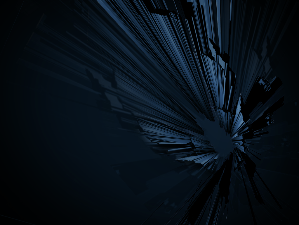 , shown below.
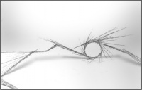
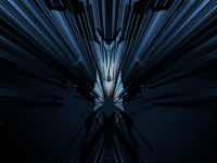
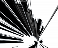
Some earlier iterations:
There's a couple of reasons why this theme relates to Fedora 14. First, the codename for Fedora 14 is 'Laughlin'. This is after Robert Laughlin, the 1998 Nobel Prize winner in physics for the fractional quantum Hall effect research he did. Laughlin argues for a concept called 'emergence' which states: "The whole is more than the sum of its parts." Kyle's proposal shows many separate lines coming together that, when you step back, forms a solid shape as well, relating to Laughlin's concept of emergence. Secondly, Fedora is a kind of a single object - a Linux-based operating system - but it's also a community made up of many individuals from all over the world and aggregating many individual open source projects and work. So the concept also relates to what Fedora itself is.
Open Feedback Area
Open Feedback
- Post your freeform feedback here! Be sure to sign it.
- I'm a bit concerned that this looks too reminiscent of a broken LCD screen. Am I crazy? --Mattdm 12:49, 14 July 2010 (UTC)
- Nelson said on July 14 @ 17:19 GMT: "Kyle's work is awesome and in a way provides a good alternative for alpha channels approach. From my point of view this allows a bit more of customization and interaction from the user. Thanks for a great submission, extended also to all other submissions."
- The lines at the top look more like a plane and at the bottom they look more like separate lines (a bit too cluttered at the bottom). Also, its tough to figure out what the lines are converging to at the centre of the image - is it just space? Overall, the image looks cool because of the steel blue effect, but it is tough for a first timer to see beauty in this image . --Sahilahuja 18:14, 23 July 2010 (UTC)
Gathered Feedback
We'll gather feedback from a variety of places here.
From Design Team Meetings
- needs more fedora blue
- needs more blue instead of black
- needs more shiny things
- too dark
- favorite is the latest mokcup
- one user's first comment was that it's kind of dizzy-looking, any way to tone it down?
Posted by --Duffy 03:09, 14 July 2010 (UTC)
Blog Post Feedback
(owner: mizmo)
Feedback
- Felix said, on July 14, 2010 at 2:08 am: "Looks already great. I hope you can get some input from Jakub for the polishment."
- Christof said, on July 14, 2010 at 2:18 am: "That finally looks like a background I would use. I think I have not used the default Fedora background or theme in the last five years."
- jreznik said, on July 14, 2010 at 2:34 am: "Nice Kitty! Sorry, I missed meeting yesterday – but I’m happy with this concept ;-)"
- Dave Pawson said, on July 14, 2010 at 3:20 am: "Re Kyles design? Yes, looks good. How to make it a little brighter? Bit too sombre at the moment?"
- Jared Morgan said, on July 14, 2010 at 5:43 am: "Love the new theme for F14. Looking forward to seeing this in a few months."
- Julian Aloofi said, on July 14, 2010 at 6:07 am: "Just my 2 cents, I think the wallpaper looks a bit intimidating. It’s pretty dark and has a kind of “agressive” depth. When I look at it, it’s not really a picture I’d like to see on my desktop every day; it’s rather something I’d expect to see in a bad dream. Maybe something more colourful? Just sharing my first impression, I don’t know how the complete theme will look of course :)"
- ankursworld said, on July 14, 2010 at 7:17 am: "Hey, this wallpaper is awesome. I’ve already begun using it :) Ankur"
- drago01 said, on July 14, 2010 at 8:04 am: "IMO this is too dark; was the reason why I didn’t like the F13 wallpaper but it seems like this trend continues …"
- Cliff said, on July 14, 2010 at 6:53 pm: I don’t like the cross lines on some of the rays. Overall it is pretty dark and a bit out of focus. Otherwise I think the concept is good.
- Shane Kerns said, on July 14, 2010 at 7:25 pm: The concept behind the wallpaper/theme is great but the wallpaper blows. Its too dark and not easy on the eyes.
- Srini said, on July 14, 2010 at 7:50 pm: Agree with Shane, it’s quite dark. Make it little bright.
- ocratato said, on July 14, 2010 at 7:50 pm: I like the concept of trying to show “the whole is more than the parts”. However I agree with others that its too dark. I tried a lighter version but then it looked like a fracture pattern in the screen – not nice. Perhaps a bit of curvature in the lines might help.
- joe said, on July 15, 2010 at 3:48 am: Mr. Julian Aloofi in his post, said exactly my thoughts. I am an avid Fedora user. Wall paper, I will change myself :) I liked Mandrivia’s wallpaper with bluish screen and a flower in middle right.
FedoraForum.org Feedback
(owner: finalzone)
- Fedora Forum URL goes here
Feedback
Fedora users mailing list Feedback
(owner: Schendje)
Feedback
Twitter & Identi.ca Feedback
(owner: RyanLerch)
- URLs to initial twitter & identi.ca posts for feedback here
- http://identi.ca/notice/41296453 (Ryanlerch)
- http://identi.ca/notice/41294289 (mizmo)
- http://identi.ca/notice/41348569 (nicubunu)
- http://identi.ca/notice/41348049 (Schendje)
- http://identi.ca/notice/41434986 (fedora)
- http://twitter.com/fedora/status/18531916105 (fedora)
- http://twitter.com/abhilashsnair/status/18570239398 (abhilashsnair)
- http://twitter.com/fedorausers/status/18466965757 (fedorausers)
Feedback
Facebook Feedback
(owner: none)
- "Lubomir Rinteł this is actually quite beautiful even though it is just a concept. By the way, is it some kind of a rule that the theme is always blue-ish, or just a unwritten custom?"
- "Rahul Sundaram Unwritten custom. Users always want blue. It is established pattern. "
- "Todd Warner I like it."
External References
- http://www.linuxtoday.com/developer/2010071402835NWRH
- http://www.malavida.com/blog/b/21575/fedora-14-laughlin-comienza-a-perfilarse
- http://linux-software-news-tutorials.blogspot.com/2010/07/fedora-14-wallpapers-winner-his-concept.html
- http://maximumitblips.dailyradar.com/story/fedora-14-theme-preview/
- http://news.debuntu.org/content/22343-fedora-14-theme-preview
- http://features.linuxtoday.com/developer/2010071402835NWRH
- http://www.linuxplus.net/2010/07/15/fedora-14-theme-preview/
- http://linuxo.com/content/fedora-14-theme-preview

