From Fedora Project Wiki
< Design
(→Bugs) |
|||
| Line 91: | Line 91: | ||
* [https://fedoraproject.org/w/uploads/b/b6/Firstboot-sidebar-f13.png F13 New artwork for firstboot sidebar] | * [https://fedoraproject.org/w/uploads/b/b6/Firstboot-sidebar-f13.png F13 New artwork for firstboot sidebar] | ||
* [https://bugzilla.redhat.com/show_bug.cgi?id=586578 F13 merge welcome and license info screens in firstboot ] | * [https://bugzilla.redhat.com/show_bug.cgi?id=586578 F13 merge welcome and license info screens in firstboot ] | ||
= String Freeze Breakage Administrivia = | |||
* trans@lists.fpo request - we have translator support: http://lists.fedoraproject.org/pipermail/trans/2010-April/007507.html | |||
Revision as of 13:55, 29 April 2010
This Document
| Version | Date | Notes |
|---|---|---|
| Version 1, This Page | 27 April 2010 | * Initial version |
Current UI
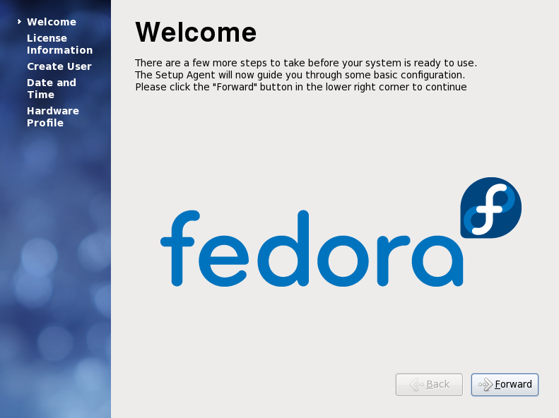
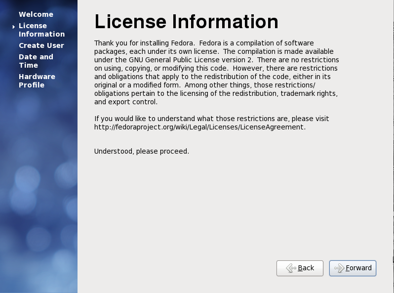
Screenshots of the current firstboot UI from Fedora 12 are presented below:
Welcome Screen
License Information Screen
Usability Issues Identified in Review of Current Firstboot
- The screen greets us with a 'Welcome', but a 'welcome' is a little out-of-place... as a user, we've already sat through an installation. Do we have to do another install process again? The user may be a little weary of clicking through wizard UIs at this point, and eager to try out their new system.
- The welcome text is pretty bland, and doesn't convey the excitement of installing a new system.
- The 'table of contents' on the left side is positioned higher vertically than the page title, 'Welcome' or 'License Information' in the right main content area.) It makes the table of contents appear more prominent/important than the actual content - your eye is drawn to the table of contents first and it shouldn't be.
- There is way too much legal text on screen, and it is too prominent. It takes up a large chunk of space. There is nothing you can do on the license information screen but click forward. It's quite unlikely most users will want to read the text. Legal text can be intimidating and we don't want to intimidate our users.
- Both the welcome screen and the license information screens have no action the user can take other than to skip them. It could be perceived that Fedora is wasting the user's time by forcing them to click through things.
- The arrow icons should not be showing in the forward/back buttons.
Suggested Solutions to Usability Issues
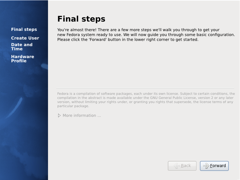
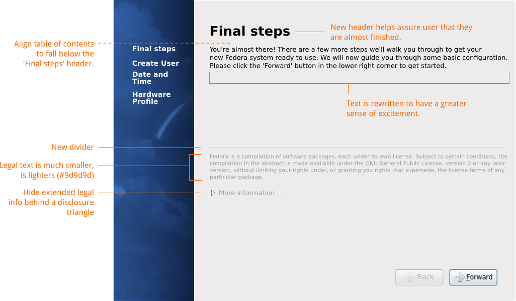
- Can we change the 'welcome' page name to be something like, 'Final steps' so the user knows they are very close and they do not have to go through a long process like installation?
- Can we rewrite the welcome text so it's a bit more exciting and friendly?
- Can we align the top of the table of contents to be just below the bottom of the right side's header so the right side's header appears first vertically?
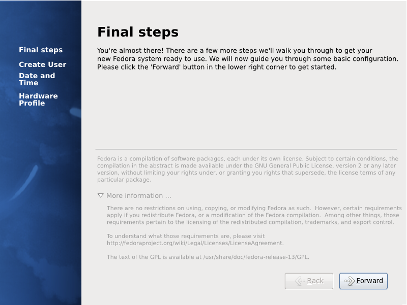
- Can we minimize the amount of legal text the user has to see? Can it be made smaller / lighter? Can part of it be hidden behind a disclosure triangle so it's available to users who want to read it, but we do not force users who aren't interested to read it?
- Can we merge the welcome screen and the license information screen into one screen, so the user only has to click through once?
- Matthias Clasen is going to work on a fix for this. It's a problem with the environment first boot runs in.
Other considerations
- Firstboot should not run in the update case. If I had Fedora 12 installed and I upgrade to Fedora 13, I should not see firstboot again.
- Labeling the first screen 'final steps' may be a bit weird in the OEM case where Fedora is pre-installed by a third party, and firstboot is the user's first interface to Fedora. The vast majority of Fedora users are not OEM installations, however, they are installing Fedora on their own system or virtual system. The language here is very friendly and sensical to the vast majority of users so I think this quandry is okay to ignore.
New License Text
Máirín talked to Fedora Legal about the license text. We came to some agreements about it:
- Since the license information in firstboot is quite dense, Fedora Legal has agreed to provide us a much shorter snippet of the license information.
- There is a larger snippet they have provided us with that we have been given permission to hide behind a disclosure triangle.
- Legal has also approved merging the license information screen with the welcome screen.
- Legal has approved making the text smaller and less prominent on the screen.
The text they have provided follows below:
Fedora is a compilation of software packages, each under its own
license. Subject to certain conditions, the compilation in the
abstract is made available under the GNU General Public License,
version 2 or any later version, without limiting your rights under, or
granting you rights that supersede, the license terms of any
particular package.
 <User clicks 'Show me more' etc.>
 There are no restrictions on using, copying, or modifying Fedora as
 such.  However, certain requirements apply if you redistribute
 Fedora, or a modification of the Fedora compilation.  Among other
 things, those requirements pertain to the licensing of the
 redistributed compilation, trademarks, and export control.
 To understand what those requirements are, please visit
 http://fedoraproject.org/wiki/Legal/Licenses/LicenseAgreement.
 The text of the GPL is available at /usr/share/doc/fedora-release-
 13/GPL.
Suggested UI Mockups
Mockup source: Media:f13-firstboot-mockups.svg
New Artwork for Firstboot
Here is the new artwork for the firstboot sidebar:
Bugs
String Freeze Breakage Administrivia
- trans@lists.fpo request - we have translator support: http://lists.fedoraproject.org/pipermail/trans/2010-April/007507.html

