From Fedora Project Wiki
(Created page with 'This page is a dump of ideas, problems, and proposed solutions for start.fpo redesign. Mailing list thread: http://lists.fedoraproject.org/pipermail/websites/2011-March/018472.h...') |
No edit summary |
||
| Line 18: | Line 18: | ||
**Possible solutions: show only titles/headlines? | **Possible solutions: show only titles/headlines? | ||
*Drop start.fpo entirely? | *Drop start.fpo entirely? | ||
*Using Google is a problem, it's a soft endorsement of a closed source application. | |||
== Mockups & Screenshots: == | == Mockups & Screenshots: == | ||
| Line 95: | Line 96: | ||
(17:08:32) sijis: so it would be start.fp.o/f15 and then there it would have some info like this: http://fedoraproject.org/wiki/F13_one_page_release_notes | (17:08:32) sijis: so it would be start.fp.o/f15 and then there it would have some info like this: http://fedoraproject.org/wiki/F13_one_page_release_notes | ||
(17:10:29) sijis: otherwise, i see no purpose and we should just point to fp.o and not worry about start.fp.o anymore | (17:10:29) sijis: otherwise, i see no purpose and we should just point to fp.o and not worry about start.fp.o anymore | ||
(17:19:28) mizmo_: i honestly think start.fpo is pretty useless | |||
(17:19:40) mizmo_: people change their homepage or just start with a search or URL in mind | |||
(17:19:48) mizmo_: if start.fpo is still using google search that's also a problem | |||
(17:19:54) mizmo_: because its a soft endorsement of a closed source app | |||
(17:21:21) sijis: mizmo_: i think we talked about it briefly. but what about using it similar to FF update notices .. sorta like a 1 page release notes. | |||
(17:21:41) mizmo_: yeh that would be useful i think | |||
(17:21:44) sijis: i do agree though, most folks are just gonna change that homepage to something they find more useful to them | |||
(17:22:06) mizmo_: they'll see the release notes the first couple of times, when it's useful, then they''ll just change it | |||
(17:22:07) sijis: most = like 95% + | |||
</pre> | </pre> | ||
Revision as of 15:29, 21 March 2011
This page is a dump of ideas, problems, and proposed solutions for start.fpo redesign.
Mailing list thread: http://lists.fedoraproject.org/pipermail/websites/2011-March/018472.html
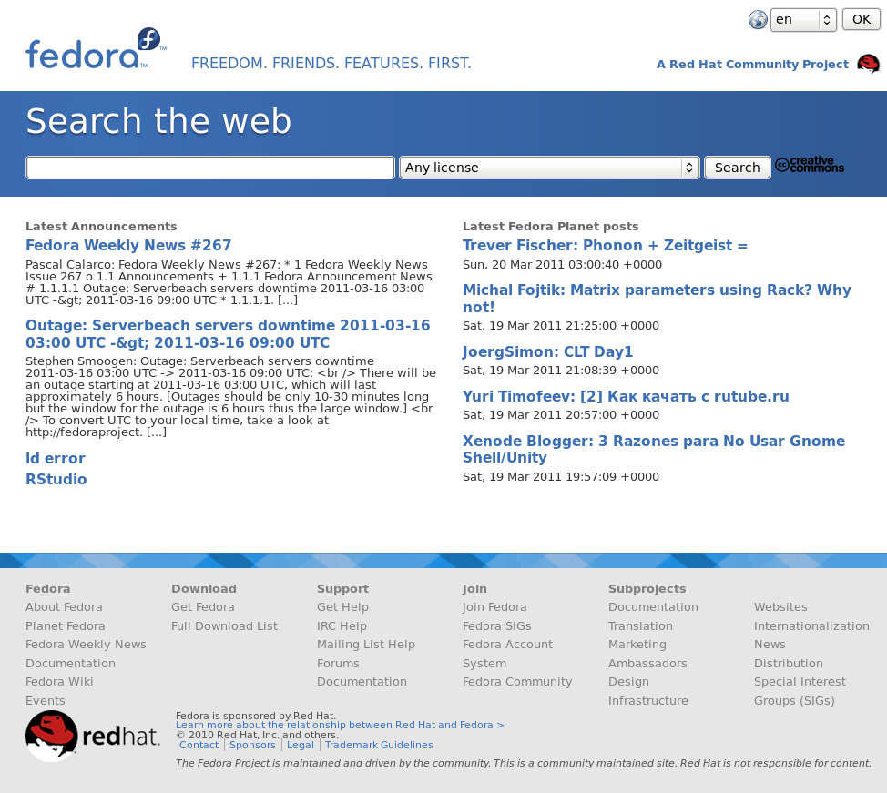
- Problem: Too much visual clutter in the current version it's good, but too messy to be a start page.
- On one hand we want to keep it simple, fast and clean, on the other hand we want to fill it with useful content, too
- The footer creates a lot of clutter. it looks good on long pages like in fp.o, but in really short pages, it doesn't look so good
- But on the other hand, it contains every link you need to find out more about the Fedora Project and is a great starting point
- Do users really need all those links? won't links to download, documentation, the wiki and the planet be sufficient?
- We are trying to keep the footer consistent
- A minimal version of the footer?
- But on the other hand, it contains every link you need to find out more about the Fedora Project and is a great starting point
- The page doesn't have a clear function
- Should it be used for searching the web? a starting point for potential contributors? a landing point after your first installation with help and getting started guides?
- Something similar to how FF has a splash page when you update the browser (similar to the "1 page release notes")?
- That would only be useful for new users
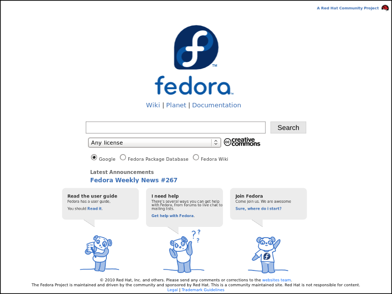
- Possible content: offer the users guides and ways to get help in a friendly graphical way (see mockup)
- Feeds creates lot of visual clutter.
- Possible solutions: show only titles/headlines?
- Drop start.fpo entirely?
- Using Google is a problem, it's a soft endorsement of a closed source application.
Mockups & Screenshots:
Currently, start.fpo looks like this:
See also: https://fedoraproject.org/wiki/User:Vinz/Projects
The complete discussion:
(11:54:07) elad661: I really think that start.fpo has too much visual clutter. i'd suggest taking https://fedoraproject.org/wiki/File:Vinz-startfedoraproject-v3.png this mockup
(11:54:07) elad661: and adding just the title of the latest announcement
(11:54:28) elad661: what do you think?
(11:54:49) schendje: elad661: you're probably right :)
(11:55:56) elad661: and my pkgdb/wiki search would also fit. (although it needs some server-side python magic to work without JS)
(11:57:05) schendje_: elad661: i really like your idea, but that's another thing we have to add to the page
(11:57:29) elad661: that's why i think Vinz's mockup is better
(11:57:29) schendje_: we need to somehow balance the content
(11:57:45) schendje_: on one hand we want to keep it simple, fast and clean
(11:57:58) schendje_: on the other hand we want to fill it with useful content, too
(11:58:22) schendje_: there's been talk of a redesigned startpage and its relevance for a looong time now, also by the Board (AFAIK)
(11:58:56) schendje_: there hasn't been any decision or plan for its content AFAIK, so we were just mucking about with this new page :)
(11:59:43) elad661: the footer creates a lot of clutter in my opinion. it looks good on long pages like in fp.o, but in really short pages, it doesn't look so good
(12:00:20) schendje_: elad661: it's massive, for sure
(12:00:42) schendje_:  but on the other hand, it contains every link you need to find out more about the Fedora Project and is a great starting point
(12:02:02) elad661: the question is, do users really need all those link? links to download, documentation, the wiki and the planet is sufficient in my opinion
(12:02:18) elad661: /s/link/links
(12:02:29) schendje_: that could very well be true
(12:02:48) schendje_: i'm honestly not sure what to do
(12:03:03) schendje_: I think one of the problems is that the page doesn't have a clear function
(12:03:12) elad661: +1
(12:03:30) schendje_: should it be used for searching the web? a starting point for potential contributors? a landing point after your first installation with help and getting started guids?
(12:03:36) schendje_: could be a bunch of stuff, really'''
(12:03:45) schendje_: should it be there at all? is another good question :)
(12:04:06) schendje_: especially since several browsers are now creating/using their own start pages
(12:04:20) elad661: yes, FF4's about:home is awesome
(12:04:47) schendje_: elad661: ohhh i hadn't seen that one yet! neat :)
(12:05:28) schendje_: anyway, so here's what I thought about the start page when I started this redesign
(12:05:42) schendje_: so we had the redesigned www.fpo and it was almost done
(12:06:08) schendje_: and someone (maybe me, probably someone else) brought up that start.fpo had to be changed in order to fit this new design
(12:06:31) schendje_: I said I could give it a shot, made a few mockups and started building it
(12:06:41) schendje_: it looked pretty much like the current one, just without the feeds
(12:07:04) schendje_: my idea was: nobody knows what's going on with this page, but the current one is really old and anything will be an improvement, really
(12:07:30) schendje_: also: since nobody knew what a good plan would be, I decided to simply retain the content and only make changes to the visual design
(12:08:23) schendje_: then we added the feeds, after some discussion of whether it would be worth the space
(12:09:23) elad661: maybe we should detect if it's the first time the user is in the page (using cookies or webstorage),
(12:09:23) elad661: and if it's the first time, offer him guides and ways to get help in a friendly graphical way (maybe pandas?)
(12:09:39) schendje_: and a few weeks ago (I'm not sure how long the new page has been up yet) apparently the mockup I built got pulled in and it appeared on the web
(12:10:03) schendje_: so it's actually half incidental that this new design is up there at all :)
(12:11:02) schendje_: elad661: I think that's a good idea to send to the Design ML after I've started a topic there :)
(12:11:29) elad661: if we add the "help pandas", and they are small enough, we could make them stay until the user decides to hide them
(12:11:35) schendje_: uhuh
(12:11:52) schendje_: mention the pandas to Mo and she'll be on board right away ;)
(12:12:23) schendje_: elad661: anyway, I've got to stop talking now :D
(12:12:30) elad661: i really think that we should use Vinz's mockup as a base and drop the current design (it's good, but too messy to be a start page)
(12:12:41) schendje_: this is pretty much all I know about start.fpo, I need to go do some actual school work now ;)
(12:12:49) schendje_: elad661: definitely possible
(12:12:53) schendje_: I'm fine with anything, really
Elad showed his mockup to Sijis:
(16:19:41) sijis: elad661: looks good. however, we are trying to keep the footer consistent across all the sites.
(16:20:01) elad661: the footer is too massive for such small page
(16:20:16) elad661: and it creates too much visual clutter
(16:20:27) sijis: elad661: i'd also be curious to know how to pull off searching pkgdb and wiki in 1 search bar
(16:21:01) sijis: elad661: true on the footer. but, i'd still like to keep somethign like that around.. even if its a minimal one.
(16:21:27) elad661: sijis: now i'm using JS... but it needs some server side script that will read the value of the radio button and redirect the user to the right search
(16:41:43) sijis: elad661: i currently see start.fp.o looking more like 'search.fp.o'. i'm not sure that's the right approach for that site
(17:07:44) sijis: elad661: actually, my thought recently has been closer to "1 page release notes".. something similar to how FF has a splash page when you update the browser
(17:08:11) elad661: but that would be useful only for new users
(17:08:32) sijis: so it would be start.fp.o/f15 and then there it would have some info like this: http://fedoraproject.org/wiki/F13_one_page_release_notes
(17:10:29) sijis: otherwise, i see no purpose and we should just point to fp.o and not worry about start.fp.o anymore
(17:19:28) mizmo_: i honestly think start.fpo is pretty useless
(17:19:40) mizmo_: people change their homepage or just start with a search or URL in mind
(17:19:48) mizmo_: if start.fpo is still using google search that's also a problem
(17:19:54) mizmo_: because its a soft endorsement of a closed source app
(17:21:21) sijis: mizmo_: i think we talked about it briefly. but what about using it similar to FF update notices .. sorta like a 1 page release notes.
(17:21:41) mizmo_: yeh that would be useful i think
(17:21:44) sijis: i do agree though, most folks are just gonna change that homepage to something they find more useful to them
(17:22:06) mizmo_: they'll see the release notes the first couple of times, when it's useful, then they''ll just change it
(17:22:07) sijis: most = like 95% +


