| Line 126: | Line 126: | ||
* bring back ransom notes! | * bring back ransom notes! (clumens sez: All the code's still there. You give us the images and it should just work.) | ||
= Firstboot splash = | = Firstboot splash = | ||
Latest revision as of 15:27, 12 November 2010
Live Media Install Walkthrough
Here are the various steps involved in installing Fedora 14 using the live media process. This excludes the entire sticky mess of downloading the appropriate ISO, properly formatting a sufficiently-sized USB key, and getting the USB key to be bootable. In this case, this was a 1-2 hour painful process I'd rather forget but felt worth mentioning as users coming into this process documented here may be quite rattled already.
Set computer to boot from USB or Optical Drive
We likely can't do much to make this easier, unfortunately. The user pain of this is worth mentioning, though.
Syslinux
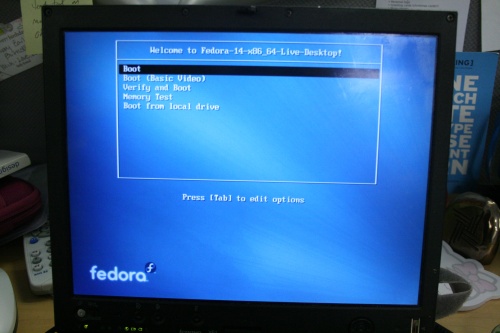
The user must pick "Boot" from the Syslinux menu.
- What am I going to boot into? Maybe better to brand with the version number of Fedora.
- Boot (Basic Video) - what does this mean? Why would I pick this instead of boot?
- Why would I pick "verify and boot" vs "boot"?
- "Memory test" - why would I pick this? Is this really the most appropriate place for this option?
- "Boot from local drive"... better way to word this so it's clear what it means?
- The interface looks outdated, does not flow with modern design compared to other distributions
- Fonts used on that screen is a legacy. It would be nice to replace it by a contemporary version.
Plymouth
Pretty bootsplash.
GDM Automatic Login Screen
File:Anaconda-f14-livemedia-ss gdm1.png
- Why can't you just log me in and not show this screen at all? Why is it here?
- Any way to highlight the login button a bit more? Doesn't stand out very much?
- Arrows to demonstrate the options along the bottom? Draw attention to them?
Click to Install icon
- Could we add some kind of 'welcome' message to outline what to do? Okay, the icon's text is pretty clear, but there's so much else on the screen distracting me...
Anaconda Screen 1
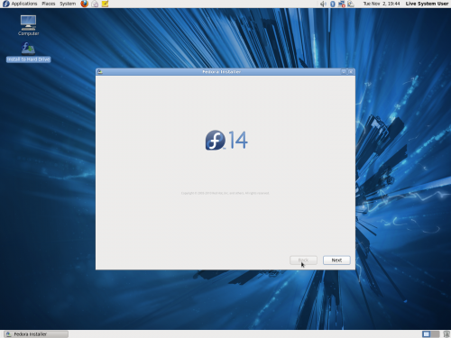
- It's a huge screen with an 'F14' in the middle and a next button. Seems to be a waste of space. Cut it! (clumens sez: This is already cut for F15.)
Keyboard selection
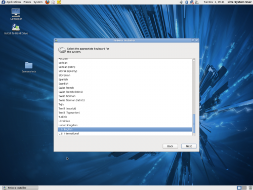
- any way to suggest a short list of likely candidates?
- does the list have type-ahead?
- possible to add search?
- very, very long list.
- what does 'latin1' mean?
Basic or Specialized
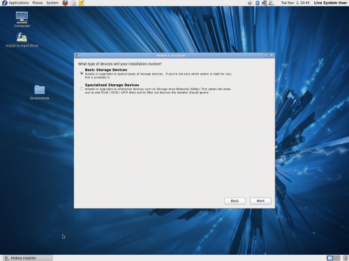
Should default to basic, specialized an opt-in later on.
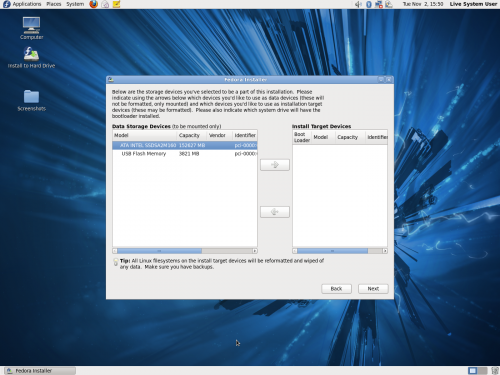
Examining Storage Devices
Hostname
- Who will see the hostname?
- What is this greyed out "Configure Network" button?
- Can you suggest a hostname for me? I'm not very creative :)
No progress bar. Why are you doing this now?
Time zone
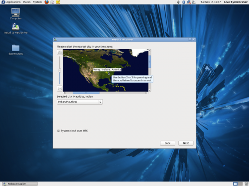
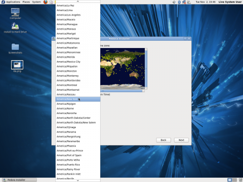
- very difficult to use. didn't notice +/- controls; would make more sense along the right side.
- dropdown doesn't seem to have type-ahead, insanely long
- system clock uses UTC - why would i want or not want this? how will i know?
- can we make any intelligent guesses?
Root Password
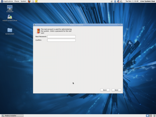
- give me some suggestions?
- rate how good my suggestions are?
Installation hard drive pattern selection
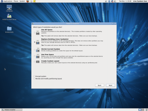
- Just pick one for me. I don't know what I want or need. Suggest the others as alternatives.
Select install target device
- not sure about this one. it just seems confusing.
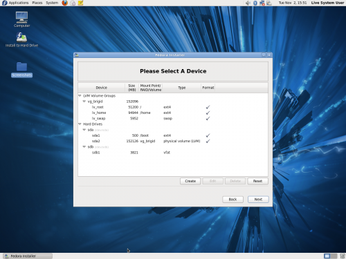
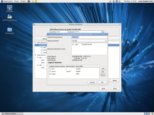
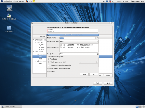
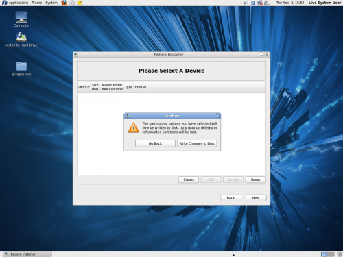
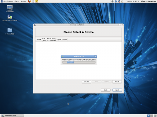
Partitioning layout (optional)
- hurts my brain.
- I have an SSD and just breezed through this. I ended up having to reinstall because LVM on an SSD sucks. Anyway to prevent this trouble in the future??
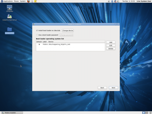
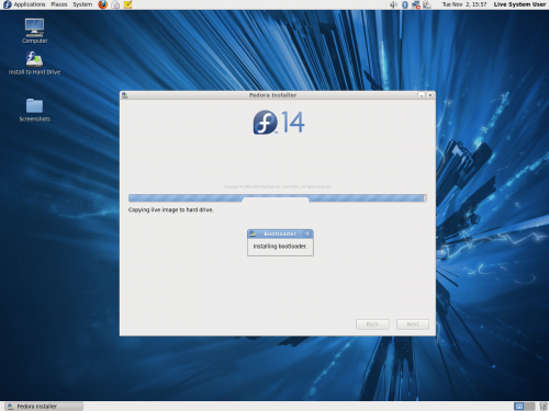
Bootloader
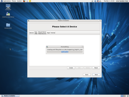
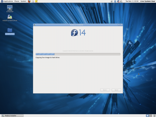
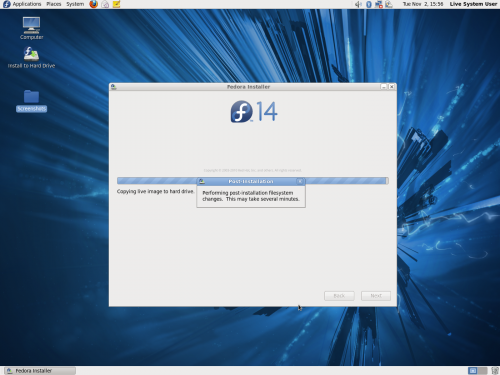
Install ........
- bring back ransom notes! (clumens sez: All the code's still there. You give us the images and it should just work.)
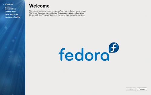
Firstboot splash
- waste of space, let's cut to the chase.
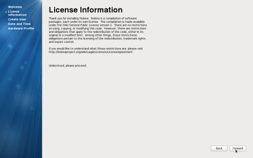
License Information
- does this have to be here? nobody is going to read this.
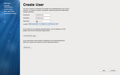
Create User
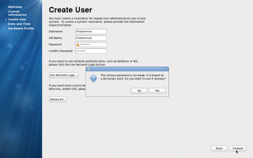
- Username
- Full name
- password
- Password check
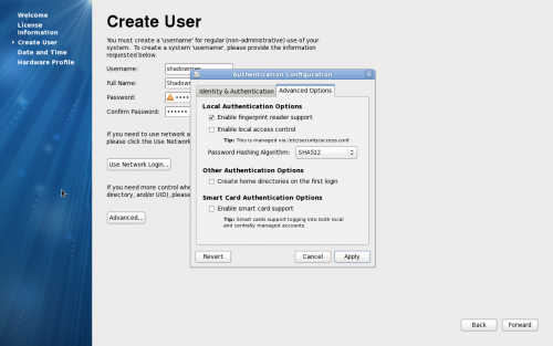
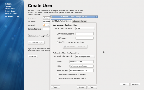
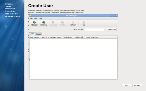
- NIS / authconfig-gtk
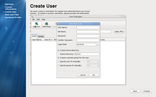
- create-user
- ask for my human name first. suggest a username based on that and let me edit it.
- password check is a nice affordance
- network login language is confusing. talk more about what envs this is useful for. maybe hide behind advanced.
- weird window management issues with advanced dialog
- add new use window from user manager aligns to the top left of the screen - seems weird
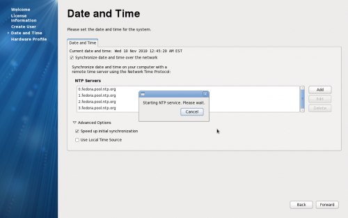
Date and Time
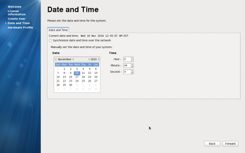
- controls are so small!
- current date and time doesn't stand out. is this according to the computer or what? am i looking to fix this?
- why wouldn't i want to synchronize with the network?
- advanced options for date and time make absolutely no sense to me. why? why?
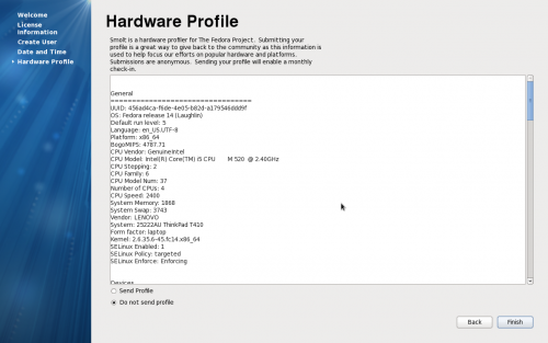
Hardware Profile
- ugly and huge. don't show it all, hide the full profile behind something and make the accept/deny buttons much more clear.
Log in
That's it. Although very difficult to change your Real Name post-install.

