From Fedora Project Wiki
| Line 59: | Line 59: | ||
[[Image:XFCE-panel-layout-mso-b.png | 500px]] | [[Image:XFCE-panel-layout-mso-b.png | 500px]] | ||
[[Media:XFCE-Panel-layout-mso.svg | Source SVG]] | |||
Latest revision as of 21:08, 13 March 2011
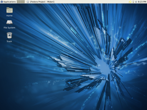
Layout A
If desired, we could put it on bottom instead of on top of the screen. The panel should be 24px to correctly show 16px icons.
Included applets:
- Applications Menu
- Needs to use themed 'start-here' icon to show the fedora logo
- We should drop the 'Menu' part— Optically separates the applet in two, provides unnecessary information
- Does the label translate correctly?
- Switcher
- Use only two desktops to not occupy too much precious space, plus 2 seems to have default for quite a while on [Gnome] Desktop Spin (before Gnome Shell)
- Window Buttons
- Extend to fill the whole available area
- System Tray
- Mixer
- Should handle pulseaudio's master channel, show pavucontrol on click
- Shown after system tray, users are getting used to it being actually status icon rather than applet
- Clock
- Use DateTime, show only time, layout is horrible when date is shown alongside time
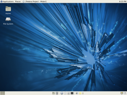
Layout B
Top applet should be 24px to show 16px icons, bottom panel should be 30px to show 22px icons. Maybe have the bottom applet semitransparent (if compositing is turned on), makes it look better (and like dock)
Top panel applets:
- Applications
- Places
- Better than folder menu as it is integrated with bookmarks and show mounted devices
- Does not show mounted archives (should bz)
- Window Buttons
- Clock
Bottom panel applets:
- Workspace switcher
- The fake screenshot shows that for the desktops being displayed in two rows, we'd need bigger panel
- We have enough space to use so we could go for 4 workspaces being displayed by default
- Put it in the corner for best accessibility
- After switcher put expandable separator
- Show desktop
- Trash
- Don't duplicate trash on desktop
- After trash put separator to optically separate functional icons from app starters
- Launchers
- Web Browser
- File Browser
- Terminal
- Put another separator after launchers
- Mixer
- Again grouped with system tray
- System Tray
- Limit icon sizes to 16px?
- After system tray put expandable separator
- Lock screen
- Log out/Shut down
- Put those two in the corner, it's there e.g. in LXDM plus this functionally and optically separates them from other icons


