From Fedora Project Wiki
m (Fix markup)
(Add graphic)
Line 6: Line 6:
== Design Usage ==
== Design Usage ==


=== The Standard Design ===
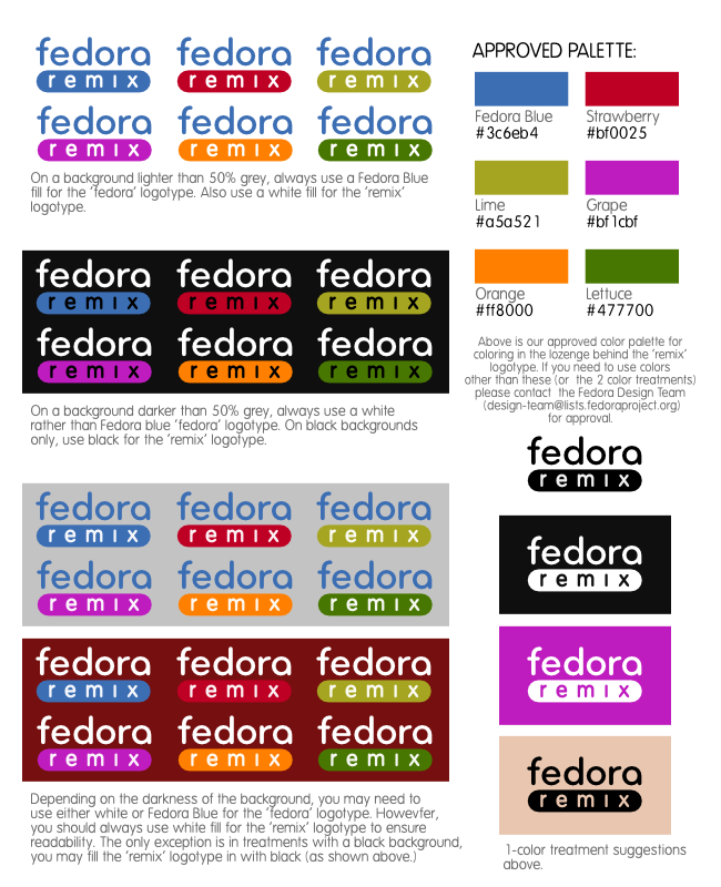
[[Image:Fedora_Remix_design_guidelines.png]]
<!-- FULL LOGO -->


=== Reversing Design Type Color to White ===
= Improper Design Usage =
 
When the logo is used on a background that is darker than 50% grey, you should reverse the type to white for legibility:
 
<!-- FOR DARK BACKGROUNDS -->
 
=== Greyscale Design ===
 
In greyscale reproduction, use the black and white version on the design:
 
==== For Use on Light Backgrounds ====
 
<!-- FOR LIGHT BACKGROUNDS -->
 
==== For Use on Dark Backgrounds ====
 
For dark backgrounds in a greyscale printing situation, we recommend the Black & White design guidelines below.
 
=== Black & White Design ===
 
Sometimes, often due to production costs, only one color of ink is available and so the design must be reproduced using only one color. The design type must be clearly distinguishable from the background color. You must honor the Fedora Remix design palette when possible, using black or white if necessary.
 
Some examples follow:
 
<!-- Black and white versions -->
 
 
<!--
## THIS DOESN'T APPLY YET BECAUSE THE DESIGN IS NOT (YET) REGISTERED AS A TRADEMARK.
 
== Trademark Symbol ==
 
The 'TM' trademark symbol must always be visible and readable for both the Fedora logomark (infinity symbol) and the Fedora logotype ('fedora' text) in the placements shown in these guidelines. You may not remove or obfuscate either of the TM symbols in the Fedora logo.
-->
 
== Clear Space ==
 
<!-- Show clearspace -->
 
== Color Palette ==
 
<!-- Show palette choices here -->
 
= Bad Logo Usage =


=== Never Switch the Colors ===

Revision as of 15:43, 3 November 2008

The Fedora Remix Design: Usage Guidelines

In order to protect and grow the Fedora brand, we have a distinguishable Fedora Remix design that can be used without permission to mark content that is derived in part from Fedora. There are guidelines for the design's appearance and usage, outlined here.


Design Usage

Improper Design Usage

Never Switch the Colors

Never Use the Design on Similarly-Colored Backgrounds

Never use the design on similarly-colored backgrounds. Use a choice from the palette that is appropriate for the background.

Never Stray from the Color Palette