Problem Statement
Background
There's a few issues with this screen. There's a bug open on it requesting that the text be changed to be more accurate. There's bigger problems than that, though.
Let's go a bit into the background of this dialog. It occurs early on in the screen flow:
[ lang selection ] => [ keyboard selection ] => [ basic or special storage ] => [ REINIT DIALOG ] => [ hostname selection ]
Here's the full order of things in the anaconda code.
The screen that asks if you have basic or specialized storage must come towards the beginning of the screen set, because it is at this point anaconda has to scan to see if any pre-existing installations are on the system in order to know if we can upgrade a pre-existing system or not. However, we don't want to scan specialized storage devices which may be mounted to the machine if we know for sure that the user isn't interested in using them as part of the install - it'll take a while, it may spins up a lot of devices that were not active using more electricity, putting wear on equipment, etc. hitting a lot of networks.
- If you pick basic, anaconda just scans local devices.
- If you pick specialized, anaconda scans local devices & network storage devices. This route also gives you the option of adding iscsi and other kinds of disks that require user input to be able to discover.
There may be a false assumption here - someone may want to use specialized storage devices as install targets, in which case scanning them for upgradable bits makes sense. However, someone may also simply want to use specialized storage devices as mounted data storage, in which case we shouldn't bother scanning them for upgradable bits.
Anyhow, once we know which devices to scan (local if basic, local+network if specialized), they are scanned and if any of them appear to have missing partition tables, this dialog is popped up.
The problem is, anaconda may not know how to read the partitions on the drive, another operating system may be able to. There *could* be data on that drive, but we just don't know because we don't know how to read it. The drive may very well be blank (if it's brand-new / baremetal) or it could be a virtual drive and have no data either. So our dilemma is:
- we can't mount the drive as a data drive if we can't read the partitions, so it's useless.
- we can't use the drive as an install target unless we completely format it.
- there may be data on the drive, we just don't know. if we reinitialize a drive that was only meant to be a data drive... we're erasing data for no good reason.
- there may not be any data at all in which case popping up the dialog instead of just reinitializing the disk and being quiet about it without causing so much bother.
Problems
So here's some of the issues the current screen has:
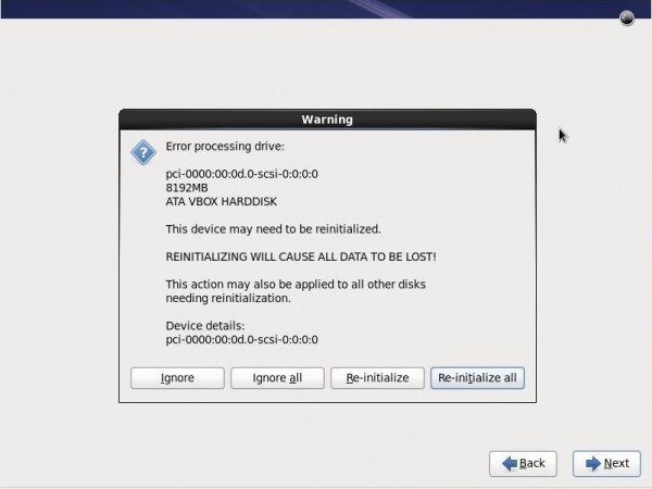
- The titlebar says warning. The text says error. The icon indicates a question. These are all in conflict with one another. This dialog is more of a warning dialog than anything else.
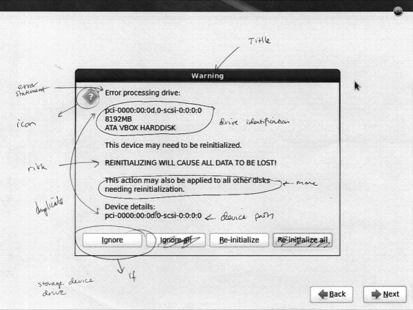
- The metadata about the drive in question is strewn all over the dialog and hard to read.
- The dialog uses the word 'reinitialized' and 're-initialized' multiple times without explaining what it means.
- THE DIALOG USES ALL CAPS
- The dialog says that re-initializing will cause all data to be lost, but actually, it will only cause data on the drives being reinitialized to be lost, and only if there was any data in the first place (which there might not have been.)
- Four buttons across the bottom of the screen is a bit of an overload, yet if we had say 100 such devices attached to the system (slices of a network drive maybe) then we would see this dialog 100 times without those extra 'all' buttons.
- What does ignore do? Ignore what? Ignore this warning and go ahead an re-initialize? Wait a minute... (It actually ignores the drive in question, removing it from the set of drives considered in the install process)
- Overall, the dialog is scary, and this fright is brought up in situations that should not be frightful - e.g., you're simply installing on a virtual machine with a virtual disk. No need for the scare!
Design Challenges
- Two classes of users who simply don't care about this dialog and for whom it's a waste of times / click effort are users installing virtual machines and users who have brand new hard drives. The default choice of reinitializing all soothes these folks.
- This dialog might come up towards the beginning of the installer screenflow, or closer to the partitioning screen. There are two storage device scans that happen - because some drives (like iscsi drives where you need to manually input address information) can't be scanned for until you hit later screens.
- We need to prevent users from clicking next-next-next and destroying a drive (That they might not necessarily own if it's networked!) by accident. This is one reason the dialog is currently a dialog rather than a regular screen. It's difficult to remove the next & back buttons in the middle of the screen flow.
- There's a big difference between what this reinitialization thing means for data drives vs install targets. Data drives are added in anaconda so automounts can be set up. We can't mount a drive that we can't read. While it sucks, it's far less sever than the other case, in which an install target can't be used unless we wipe it.
- We can't move the basic vs. specialized selection screen to be with the rest of the storage device screens, because it's the scan that takes place here that determines if an upgrade is possible (it examines the drives, looking for pre-existing & upgradeable installations.) The problem here is that it's really not smart to just go scanning any network drives available for pre-existing installs unless we know for sure the user intends us to do that.
Questions
- Is the default choice of 'reinitialize all' the right choice? (Not sure. We make a choice here between making life easier for virt installs or making life easier for folks who don't want to lose data. We don't know how large these populations are relative to each other.)
- This dialog is separated from other storage-related screens. Can we move it closer to the partitioning screen? (Maybe.)
- Reinitializing currently affects all drives scanned, without any filtering by the user (besides the local or local+network drives selection). Can additional filtering be added?
- Reinitializing currently affects drives meant to be part of the install target set AND drives merely meant to be automounted to the system. Can we limit it to only install-target drives?
- If a user really cared about the data on a drive, would they really select it as an install target? (Probably not.) In that case, do we need to warn them that data might be lost if they use a drive with an unreadable partition table as an install target? We already warn them that any drive used as an install target will be wiped!
Mockups
Radio-button approach
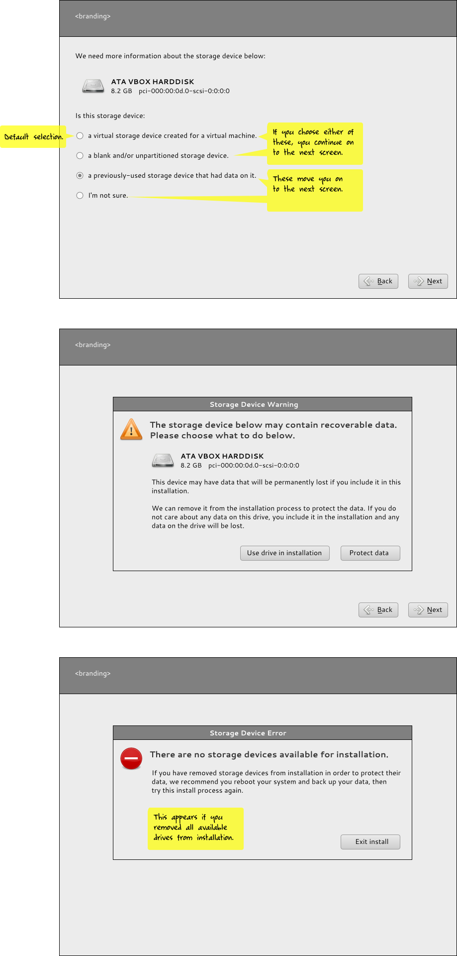
In this approach, we think about the different types of users who might encounter the dialog and offer those users who have any data to lose an easy way to avoid the entire reinitialization screen and its related stresses.
We only display the radio button dialog If one or more missing partition table drives are detected. If the user says the device is virtual or blank, we reinitialize it without asking. If the user says the drive had been used before or they weren't sure, we give them the scary reinitialization screen.
Some issues with this idea is that it's not very scalable - you have 100 drives you can't read, you get this radio button dialog for 100 drives. Ouch. We could potentially provide a list view of all unreadable drives, but right now anaconda pops them up as it goes. It may be possible to poll all the drives first, cache the data, and then present a list, though. It's simply not possible in anaconda right now. But with a list of multiple drives, the multiple choice selection won't work any more - each drive might be different. Um, so maybe not the best idea - or at least, this approach needs more work.
If you remove all the drives from the install to protect them you get the last dialog - we can't install if there's nowhere to install to. :)
Media:storage-reinit-idea1.svg
Text-massaging approach
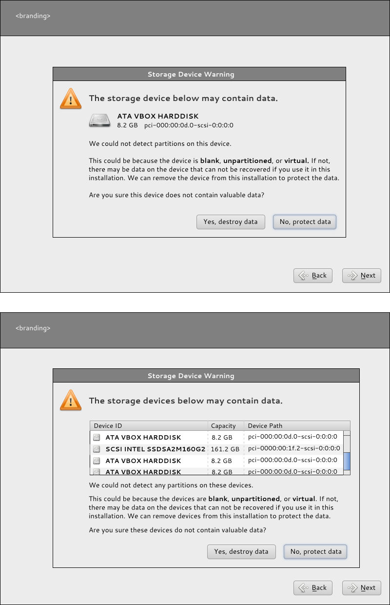
This is a less-weighty approach to apply in the meantime, without a lot of underlying code change. Except, oops, it does require too many underlying code changes. Right now there's no caching of drive data, so the dialog pops up as anaconda scans drives and detects missing partition tables. So anaconda doesn't know, until it knows, that a drive is unreadable. So the multiple list view won't work here.
It's a better approach than the next one though, which is more compromising to the current state of anaconda's functionality. One thing to note here - if you have one drive that can't be read, you see the first screen. If you have more than one drive that can't be read, you see the second screen. So the mockups in this screen are either/or, they are not a sequence.
Media:storage-reinit-idea2.svg
Text-massaging approach - simplest
This approach caused the least code churn so it's the one we'll go with in the meantime we figure out the larger problems here.
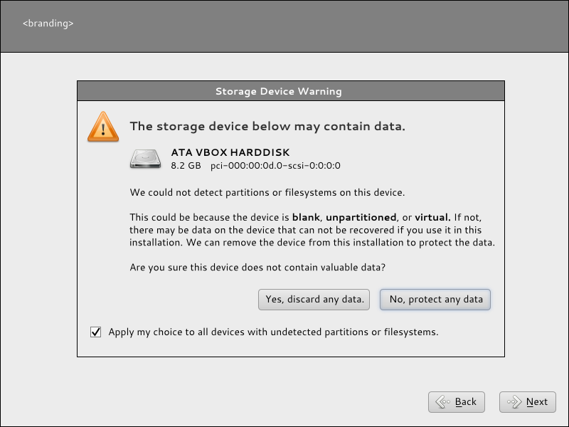
Note the button text has been changed - it says 'Yes, discard any data' and 'No, protect any data.' We say any data because there may not be any data at all. Saying 'discard data' makes it sound like there actually is data to be discarded. We say 'discard' rather than 'destroy' because it's a little less frightening of a word I think.
Rather than having four buttons along the bottom, we have two that apply to the single device in question. For our virt-installing friends, we have a checkbox that will enable the button to apply to any such devices.
So while we have a new layout and new language, the functionality is unchanged.
Media:storage-reinit-idea3.svg
Where to go from here
My current latest idea to show the list of drives and ask the user if there is any data they care about on those drives, because we can't read them and will need to erase them to use them in install. Then give users the options to remove them from the install process / protect them one-by-one with the option to check off the drives they care about the data on. (or vice-versa, check off which drives they want to use for the install.)
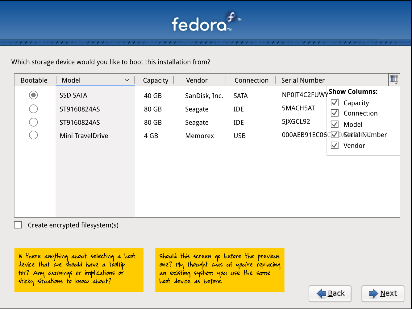 . This was removed at the last minute because of complaints that we ask for too much information about storage devices in the UI. I think part of the problem is because we only worked on the storage UI, not the entire anaconda ui, so there was some redundancy or at least the appearance of such. This time around hopefully we'll get this right since we're looking at the entire UI.
Sketches
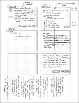
Here's some quick paper thumbnail sketches that were used to create the mockups above:

