From Fedora Project Wiki
< Design
This Document
| Version | Date | Notes |
|---|---|---|
| Version 1 - this version | 22 March 2010 | * Initial version |
Review of Current UI
Main Window
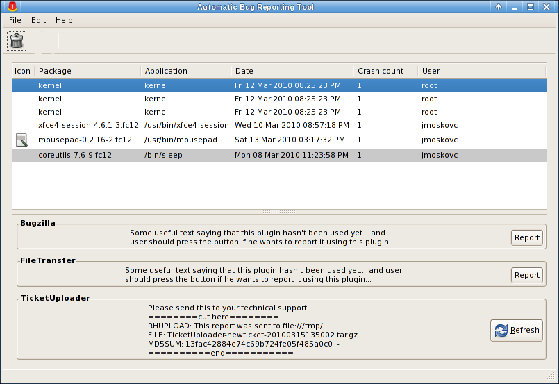
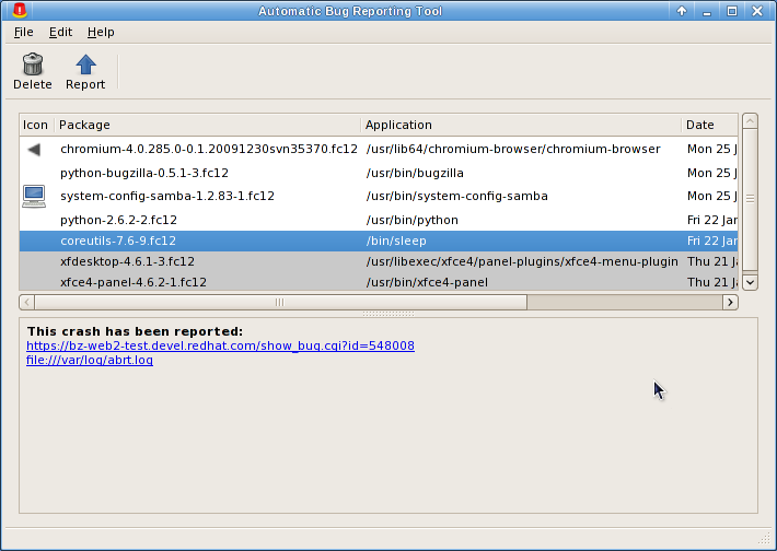
- icon column doesn't really serve useful purpose - most icons are missing. why are they missing? if they are going to be mostly missing maybe remove the column - horizontal space is at a real premium here it seems.
- full NVRE package name necessary?
- are both the application & package name necessary in the list? is the full path of the application needed?
- is the user name a necessary column in the list? it seems like extended info you wouldn't need in an overall summary.
- is crash count useful information? necessary in the list view?
- date for latest crash? needed? how about the date i reported the bug?
- horizontal scroll is generally not good.
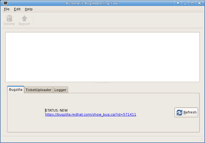
- Requires an additional click to see if you filed a bug, and to view crash report. Why is the BZ status not in the list?
- Showing bugzilla / filetransfer / ticket uploader as plugins could be confusing. what they do for the user is more important than the fact they are plugins.
- buttons along the top - a little difficult to find there. Generally GNOME UIs with lists place the buttons next to the list the buttons affect. GNOME HIG recommends making the toolbar able to be turned off and on which means you probably should have an alternate way to access these functions (see http://library.gnome.org/devel/hig-book/stable/toolbars-appearance.html.en)
- GNOME HIG advises turning of the border around frames.
- the tabbed interface at the bottom of http://jmoskovc.fedorapeople.org/abrt_all_in_one2.png looks cleaner, but I worry it obscures the workflow you're trying to enforce. tabs tend to be used in a more ad-hoc manner. you're also decreasing the ability of the file transfer and ticket uploader which i think means folks are going to be less likely to notice and use it.
Report Dialog (State: Not Reported Yet)
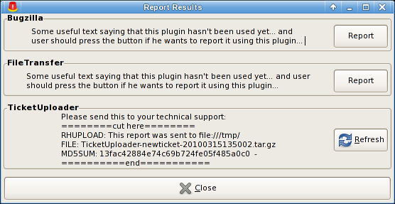
- If you have the linear flow of report => transfer file => upload to ticket, why not create an assistant/wizard to manage this?
- close button shouldn't take up the entire width of the window.
- GNOME HIG also advises turning of the border around frames. (See http://library.gnome.org/devel/hig-book/stable/controls-frames.html.en)
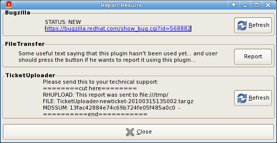
- Title 'Report Results' isn't appropriate in the situation where you haven't reported the bug yet.
Report Dialog (State: About to send in report)
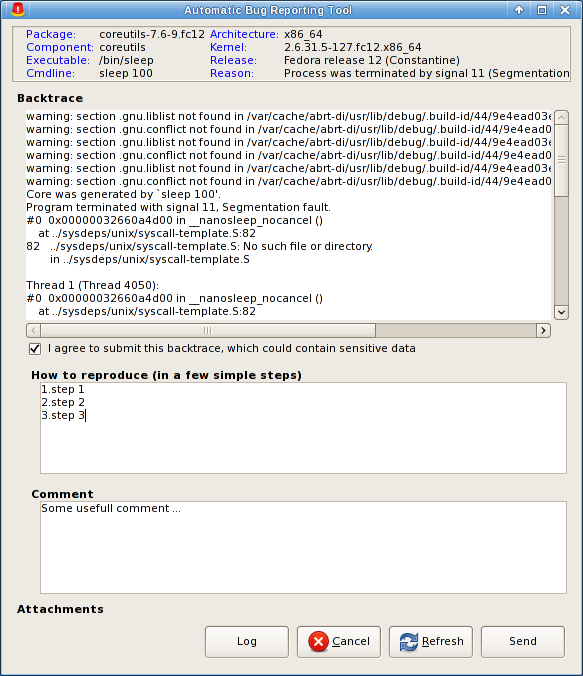
- backtrace has a horizontal scroll. This makes it more difficult to read. can you wrap it at 80 characters?
- why is there blue text in the top? are those clickable links?
- is backtrace editable so you can remove sensitive data?
- there's an attachments field, but how do i attach attachments?
- what does the refresh button do?
- what does the log button do?
Report Dialog (State: report has been sent)
- what does refresh do? if it resends the report, name it 'Resend Report'. Why would someone do that, though?
- is 'report' an appropriate label for the file transfer section?
- why not put the copy/paste text for the ticket loader in a more-easy-to-copy-from text input form field? or rather than requiring copy paste manually with a mouse drag and Ctrl+c, why not have a button that says 'Copy to clipboard'? (other GNOME apps have this, eg. the character map)
Mockups
Source
All mockup source is here:
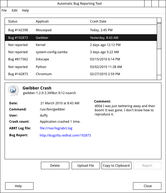
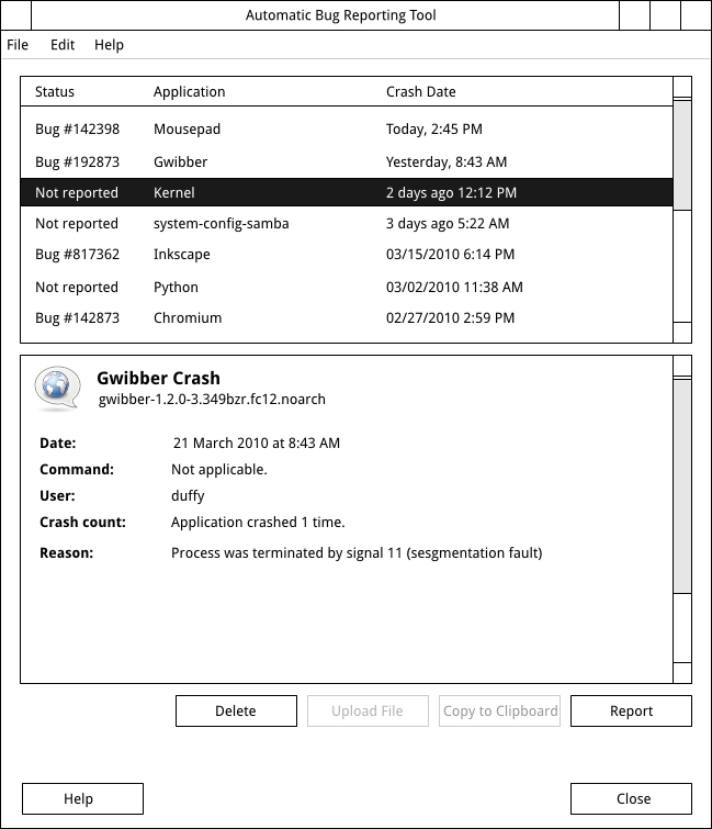
Main Window
Reported Bug
Unreported Bug
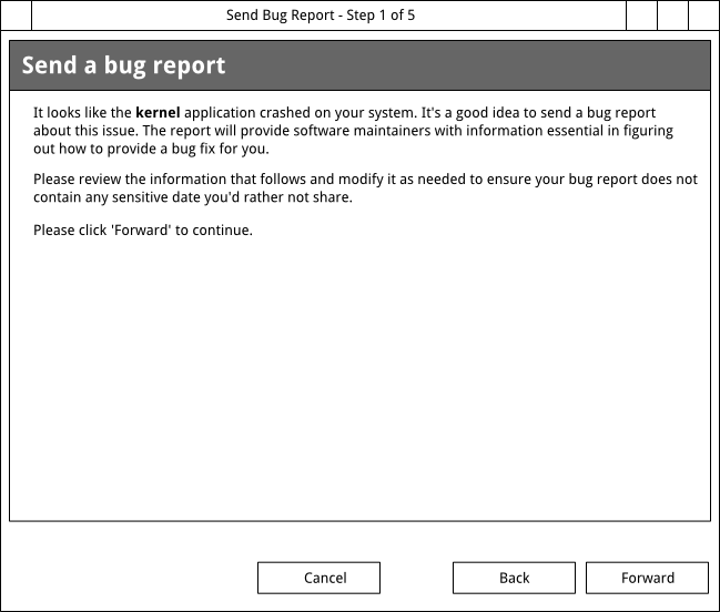
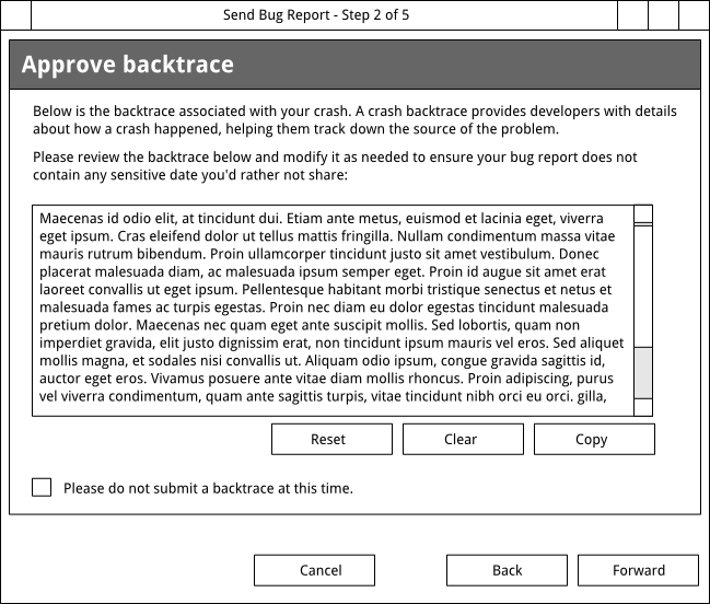
Report a Bug Assistant
Intro Screen
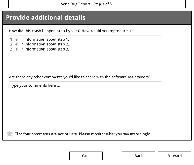
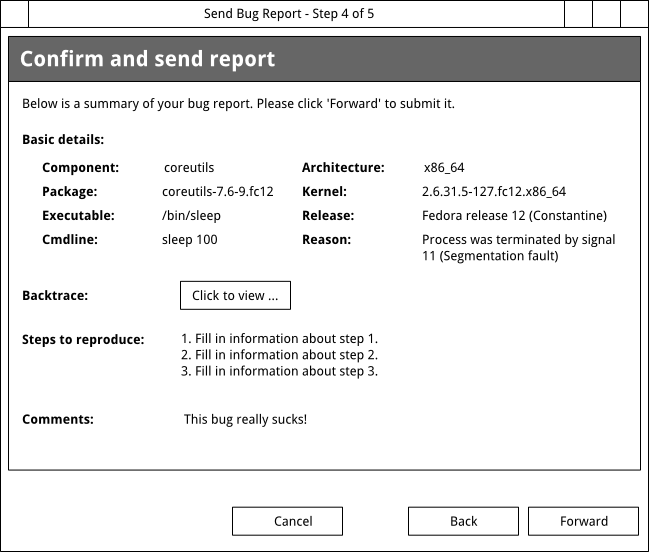
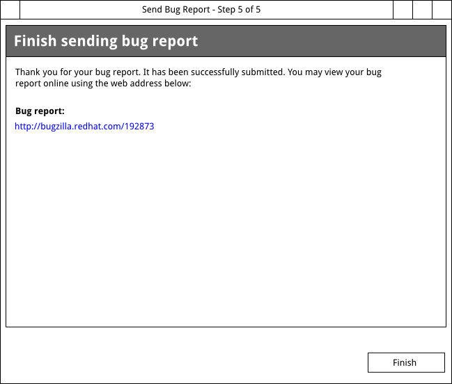
Approve Backtrace
Extra Infos
Confirm
Finish
Current UI
Main Window
Dialogs:
Click “Report” and this dialog shows up:
- it contains the enabled reporter plugins with their “results” if the plugin was used
- Refresh button will re-report the incident and is shown only if the reporter plugin was used
- Report button is shown only if the reporter wasn't used
- after clicking on Report/Refresh the report window pops up:
When the report is send, the message for the respective plugin is updated in the “Report Result” window:

