Background
See bug #475978
UI Components
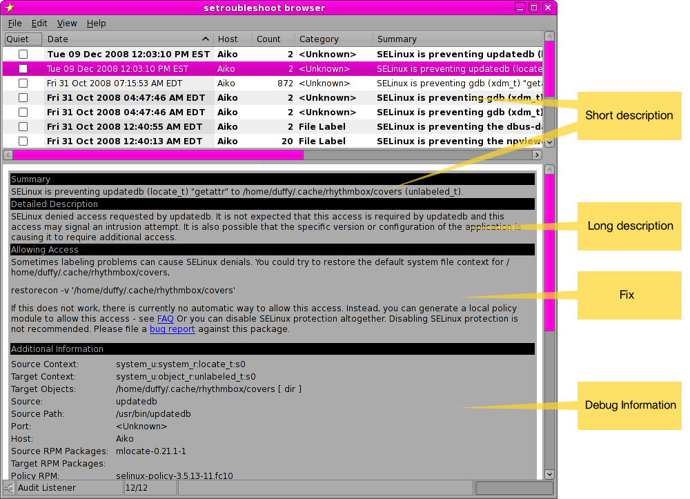
Quick UI Review
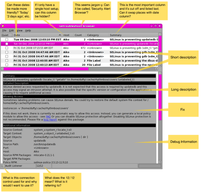
Summary of Suggestions
- Use shorter, more human-readable dates for the date column up-top. "2 days ago", "1 week ago", etc. Specific time stamps can be displayed in the details pane.
- Do not display the host column if the system is only configured for one host.
- Swap the summary and date columns so summary appears right after the quiet button.
- Rename window title "Security Alert Browser"
- Remove lower bar with 'audit listener' '12/12' and connection toggle unless there's a really good rationale for it being there.
- Get rid of short description. It's just an ellipsed form of the long description anyway.
- Hide the debug information by default. Only show it if explicitly asked for. By default it appears quite intimidating.
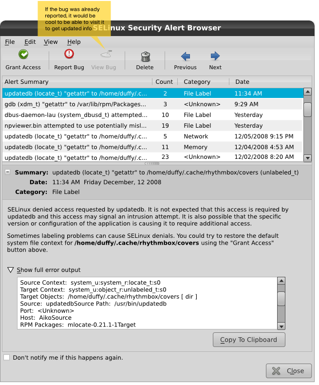
Revised Browser UI
Here's what the browser could look like following the above suggestions:
Mockup Ideas
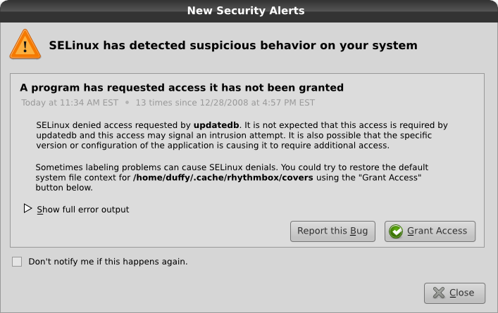
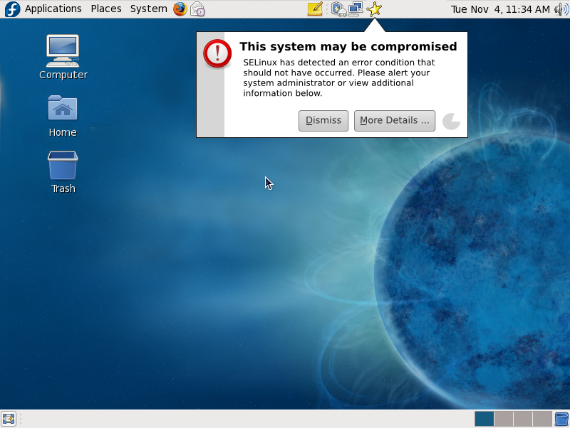
Desktop Alerting Tool for Non-Critical Alerts
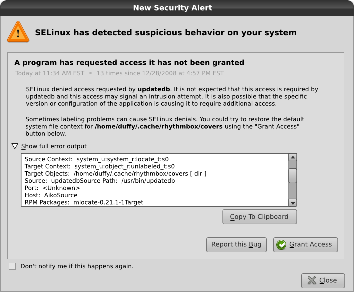
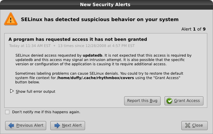
Alert Details Window
When you click for more details about an alert, you could get a dialog like this that is focused on the alert that just occurred. (To see other alerts, you could go to the browser via a right-click on the setroubleshoot panel icon or through the regular application menu path)
Unexpanded
Suggestions
- next/back button for browsing through multiple AVCs
- count of how many times it happened
- delete avc completely / quiet avc
- date/time it occurred
Expanded
Unexpanded, Multiple New Alerts to be Reviewed
NOTE: if the user clicks "close", it will close the dialog and all alerts immediately. it won't function the same as the 'next' button. and those alerts will not pop up again. If the user needs to review them at a later date, they can look in the selinux alert browser.
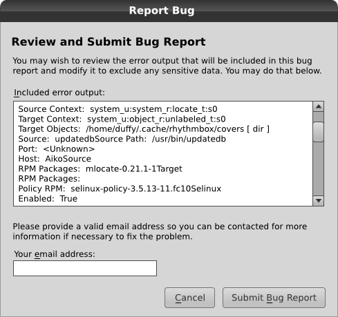
Bug Report Window
File:Setroubleshoot-ui bugreport mock1.svg
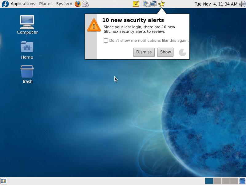
Desktop Notification for Missed Alerts
Desktop Notification for Critical Alerts
Other Ideas
- Use audit2why to have a 'install new policy' or 'apply new policy' button for applicable alerts
- Only show the 'submit bug' button if audit2why detects the alert as being a bug (otherwise always allow bug filing from the file menu of the browser)
- Be careful about scaring users who can't do anything about critical/scary security alerts
- Multi-host alerts - will people be using setroubleshoot to monitor alerts on multiple servers? How to make feature more obvious? We need better understanding of this use case I think.
- Sending email - send email to root@localhost for now (although it would be great if firstboot would let you configure a default system email address, clumens mentioned he may be working towards something like this) as an option for non-desktop users
- Critical SELinux alert - any way to display it on the terminal when logging in locally or remotely for non-desktop users?
Other UIs to consider
- http://mihmo.livejournal.com/66637.html <= Growl, OpenTTD
- AppArmor training mode UI - start with confined policy then punch holes in it
Misc
Some feedback: http://tieguy.org/blog/2009/12/23/continued-notes-on-the-macbook-experiment-week-3/comment-page-1/


